Loki, the god of mischief, is the black sheep of his family, his home realm, and routinely of the Marvel Cinematic Universe. His behavior has at times demonstrated the darkest impulses within the MCU and at other times he’s surprised fans by allowing tremors of humanity to guide his choices. He is a bucking bronco hell-bent on making his own way and not conforming. It was this maverick energy that the design of Loki was determined to subvert. In the face of his spirit we needed to conjure an unyielding mountain of bureaucracy that would roundly crush his individualism into submission and conformity. The series begins with the TVA’s bureaucratic stormtroopers ripping Loki out of his reality and literally deleting it. Everything he knew or had planned was unceremoniously binned and now he begins his imposed journey of self-discovery. The opportunity was clear: with this black sheep character at the center of our story, we had the chance to make a visual black sheep within the MCU, something that looked and felt distinct from all that had come before it.
The synopses I read in advance of my pitch meeting described the style of the TVA as Blade Runner meets Mad Men. As for Blade Runner, I don’t think they let you into the ADG unless you can draw a spinner from memory; and growing up in Southern California, I had spent a lot of time in precisely the type of clean, economical, but whimsical mid-century modern municipal architecture that blossomed in the United States in the postwar era. From my K-12 public schooling, to the local post office, to the DMV where I got my driver’s license, all were built in this mid-century modern style. This was the starting point in my mind of the institutional bones for the TVA.
From our initial meeting it became clear that director Kate Herron and I were in total sync on the visual terrain that would serve the story best. Without having seen her pitch deck, my own deck included a spectrum of research from the world of Terry Gilliam, the stoicism of English Brutalism, the whimsical warmth of American mid-century modernism, and the strange and severe shapes of Eastern European modernism. Anachronism was another major visual cue we both agreed upon. The unknowability of a space or piece of technology’s chronological origin. The desire to make the world of Loki feel at once so familiar as to be nostalgic and yet chilling in its uncanny strangeness. Like a very detailed memory that you can almost smell even though you know for certain it never happened. The world would be populated by aberrations. Things so close to the miscellany of our own world and yet with small details that make them unmistakably alien and weird: VARIANTS.
We knew the TVA needed the grime and patina of the familiar institutions of life. Elementary schools, hospitals, airports; we wanted that familiar tactile quality to ground the monolithic scale and the whimsy of our fantasy modernism. In early conversations with Kate and our DP, Autumn Durald Arkapaw, we quickly realized that we needed to shoot as much practically as possible in order to lock in this grounded, real-world feeling. We needed to build 360° sets with—and this part is controversial—complete ceilings. This was the way to give these spaces the motivated light they needed to feel real. Autumn became an instant creative visual partner, and my desire to integrate the lighting into dramatic architectural ceilings was in perfect sync with her extraordinary and dramatic style of shooting low wide-angle coverage. It was an excellent match from the beginning. This began a process of working with the director, writers, and producer to consolidate action into specific sets and build up the page counts to the point where we could justify these huge builds with large hung ceilings. Fortunately it was one of the most talented and collaborative groups I've ever had the privilege of working with. Ideas flew and before long we were able to arrive at the major anchor spaces of the TVA.
Like a very detailed memory that you can almost smell even though you know for certain it never happened.
The TVA
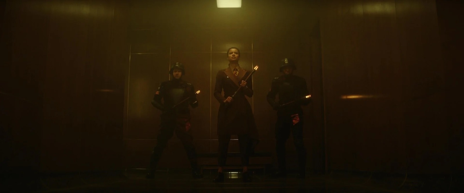
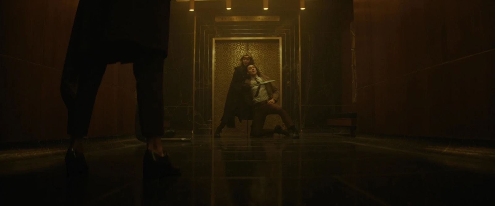
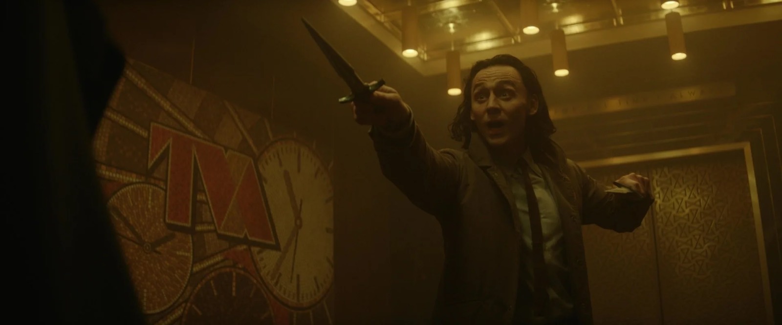
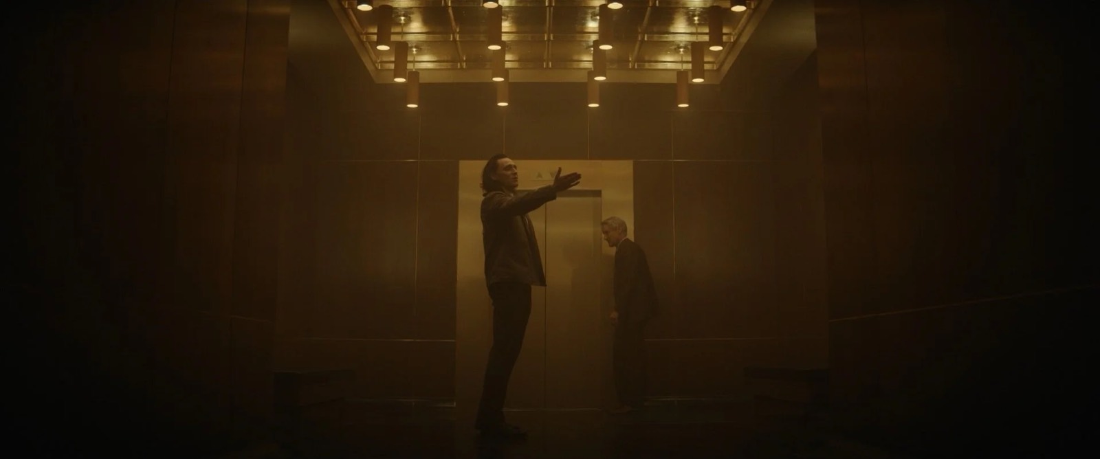
Style, fashion, technology all evolve in the flow of time. The TVA is an organization that exists outside of time; let that sink in. The folks that make up the TVA have been plucked from different eras, places, and permutations of reality. So what does this organization look like? The mid-century look the script described made a lot of sense as we were building a monolithic bureaucracy. Precisely the type of well-resourced, brutal and overreaching organization that blossomed in the United States on the heels of victory in the postwar era.
Receiving & Processing
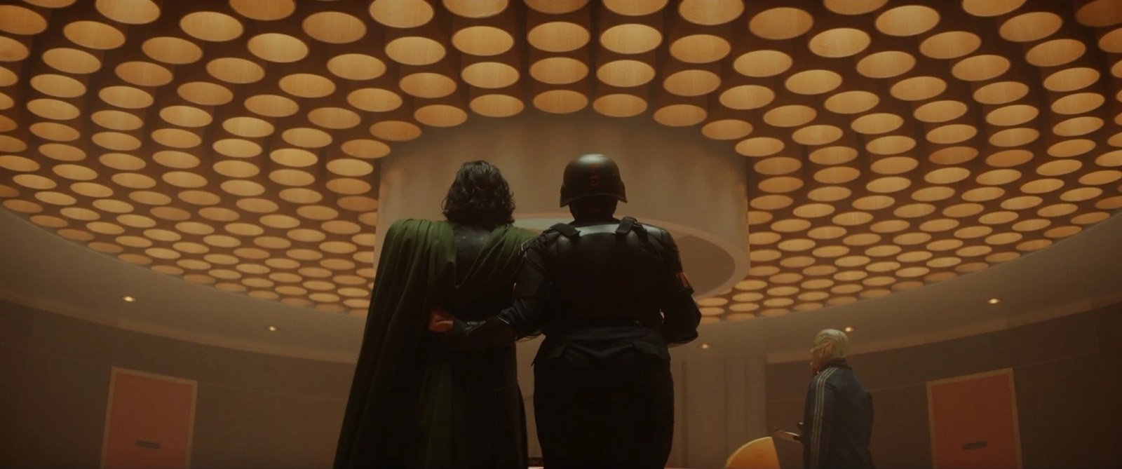
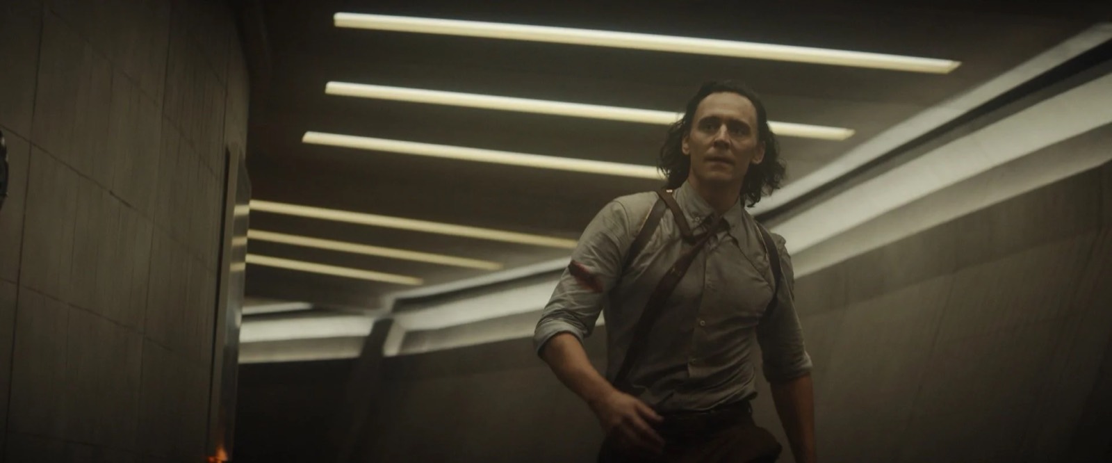
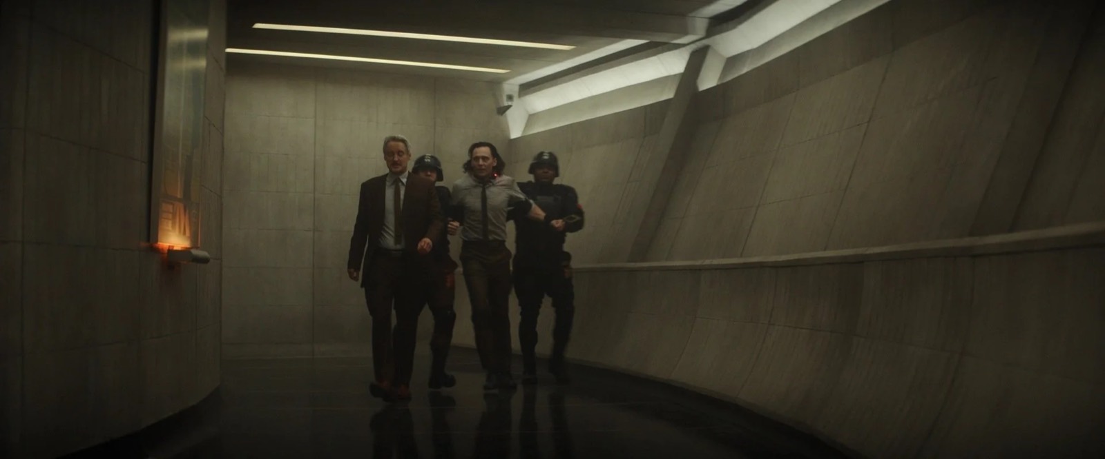
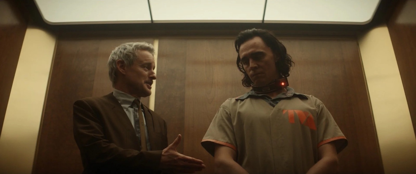
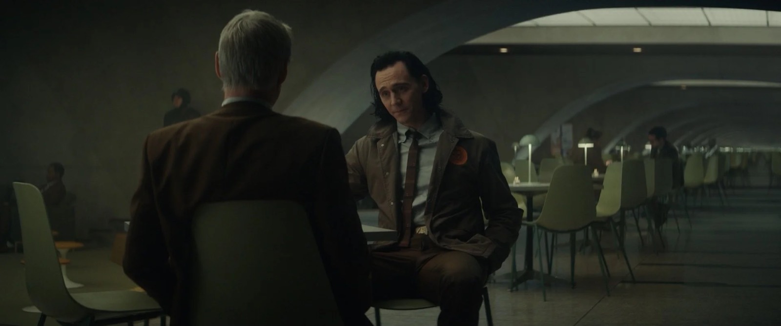
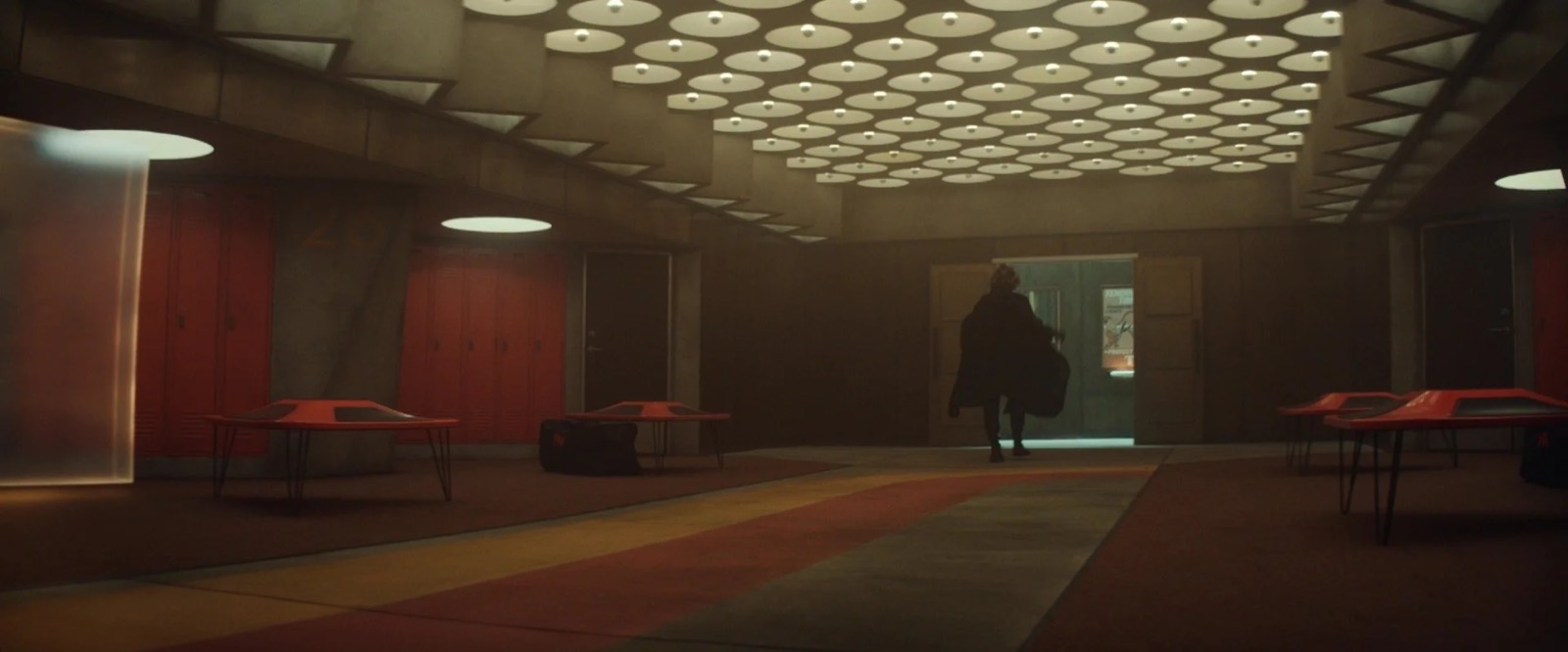
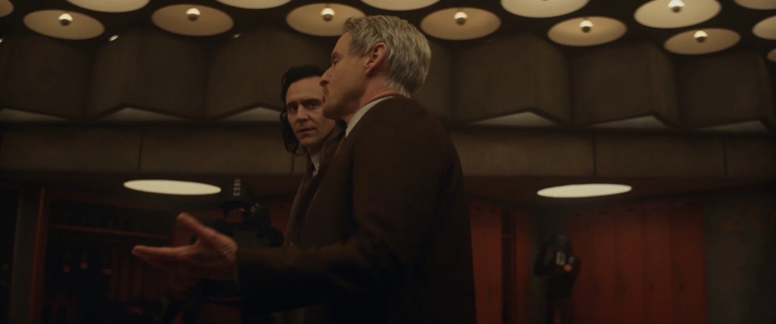
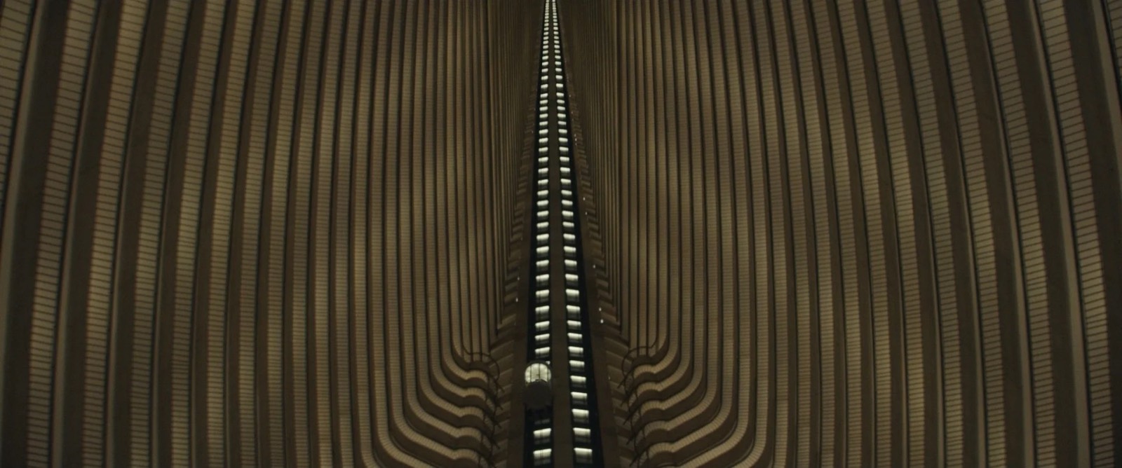
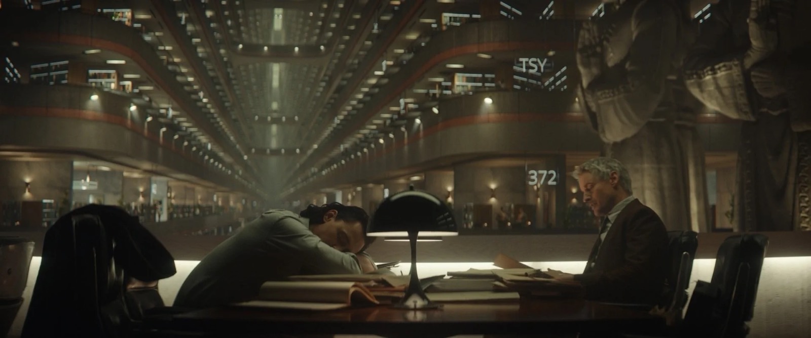
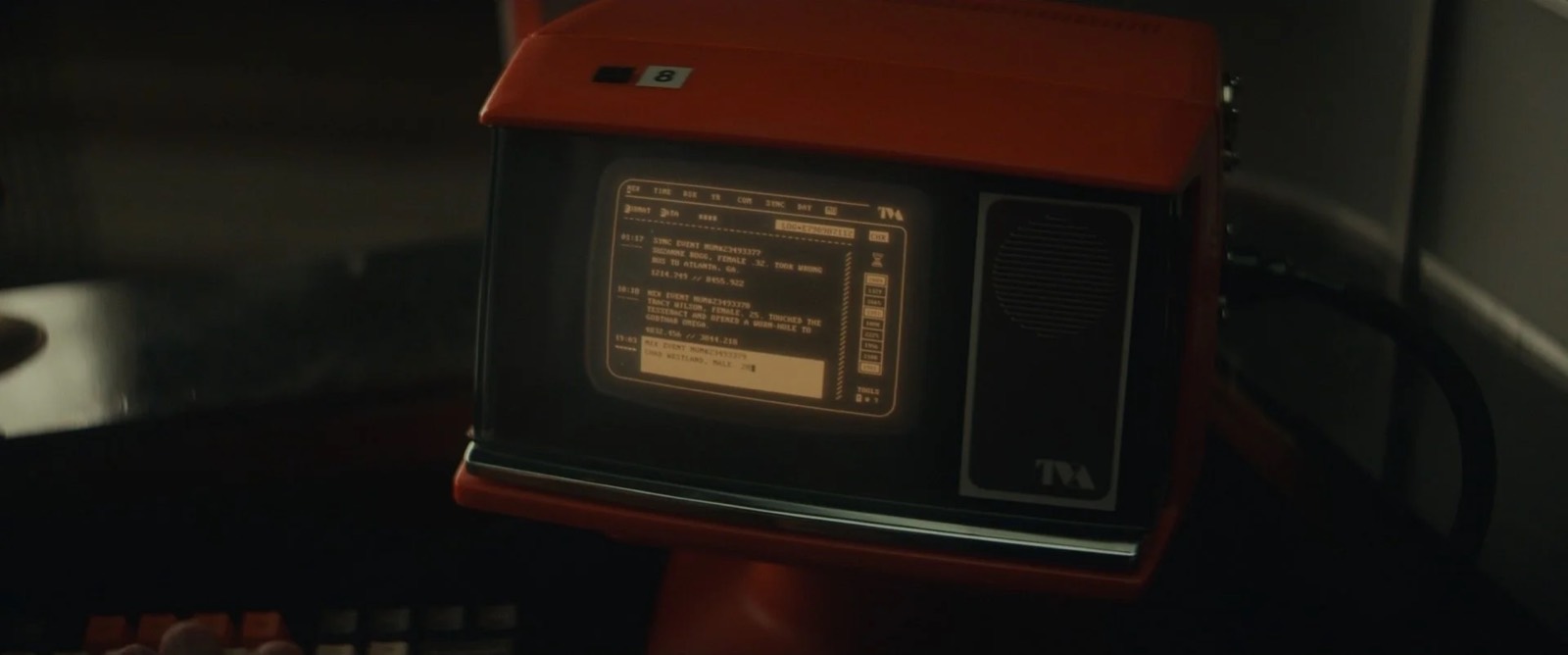
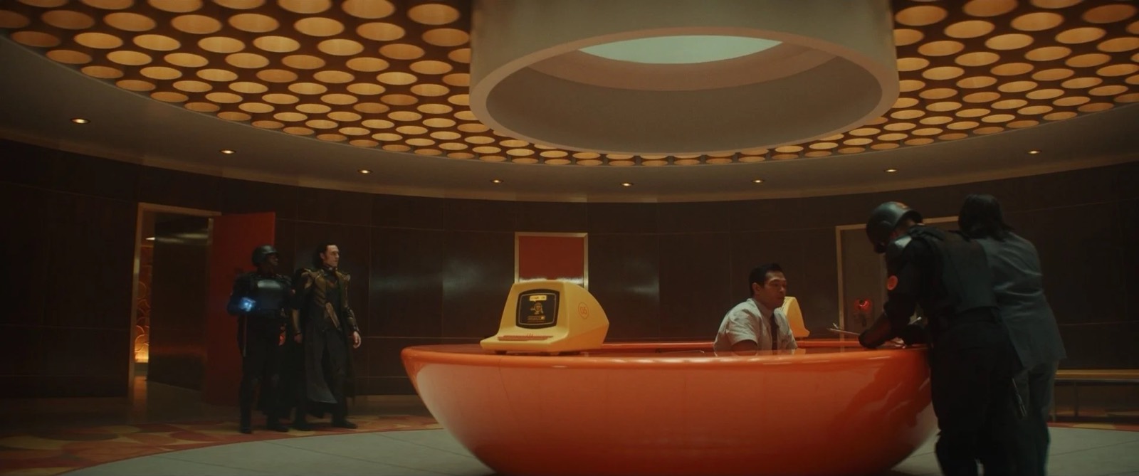
When you first enter the TVA the hope is that one is bewildered by contrasting visual elements. Warm and soothing earth tones that are signatures of American mid-century modernism adorn a confounding, windowless, circular room. Set designer Nick Cross expertly laid out hundreds of light tubes in a dizzying ceiling. As one is checked into Receiving, every direction looks the same, orientation is elusive and soon you’re unceremoniously shoved into a narrow metal processing chamber. Here we paid homage to Terry Gilliam’s masterpiece Brazil, from the smirking robot that wordlessly incinerates Loki’s fine Asgardian clothes to the beleaguered lifer clerk wasting away eternity with his cat behind a tiny screened computer. Art director Drew Monahan and set designer Rob Johnson meticulously detailed and art directed the various Gilliam-esque gadgets to perfection.
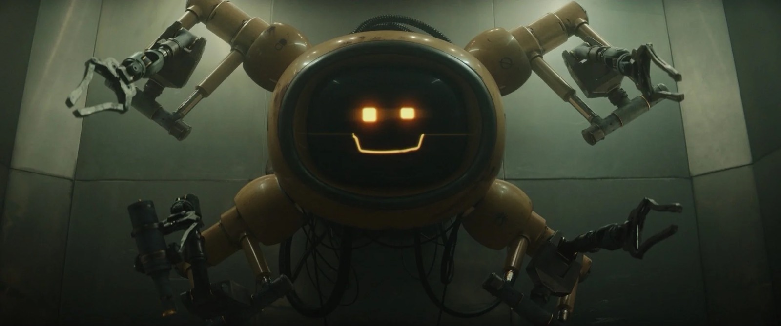
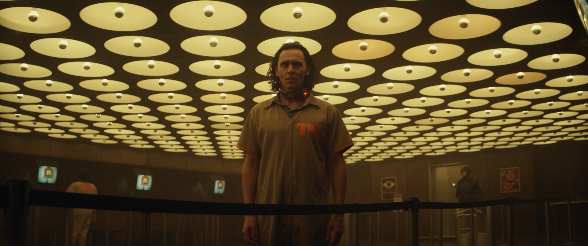
The Miss Minutes Queue
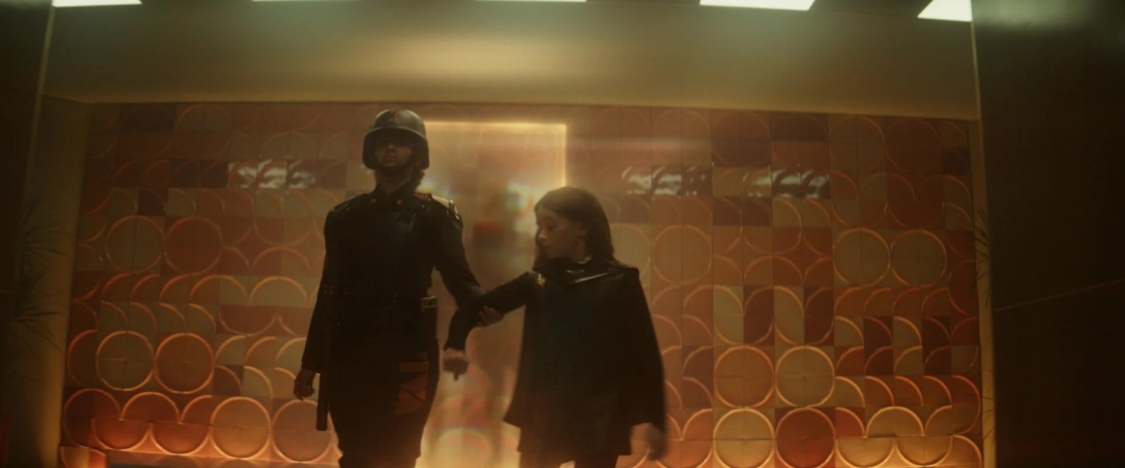
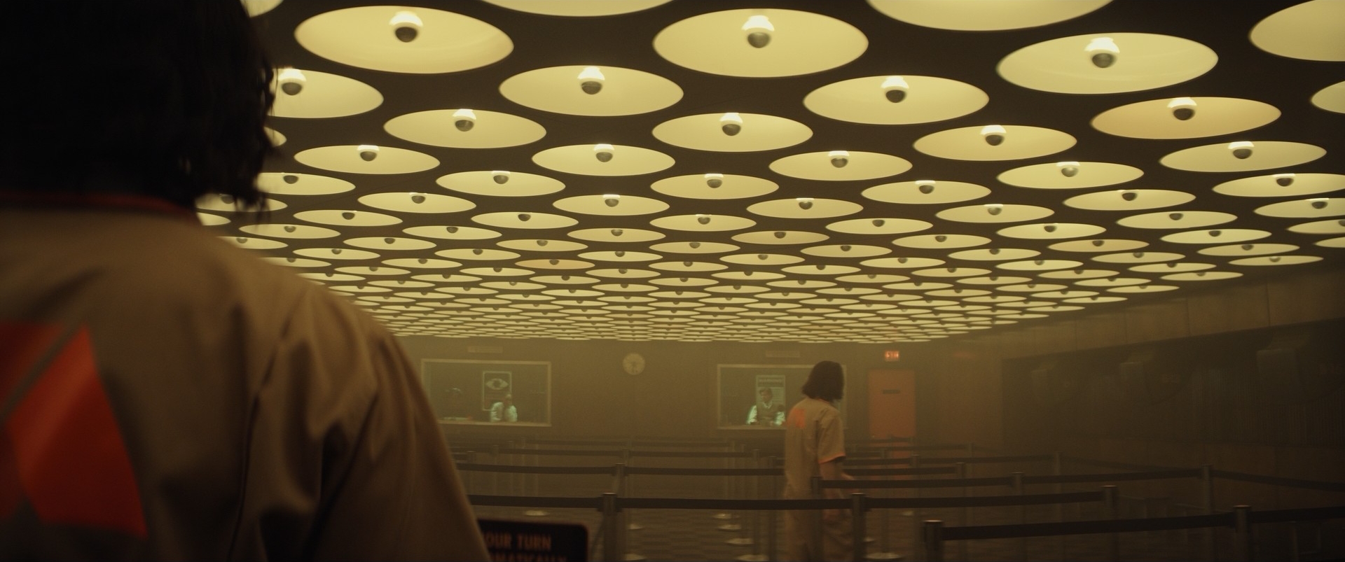
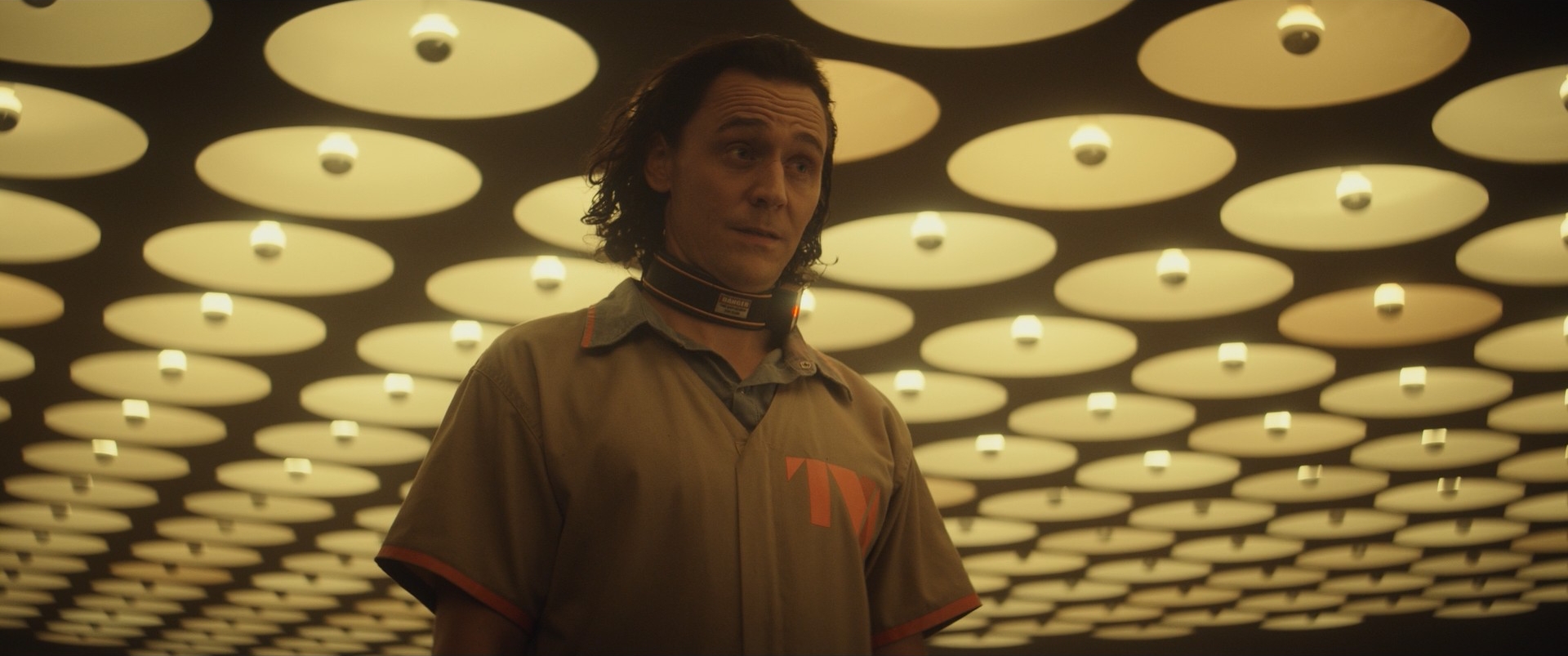
Straight away I knew the spirit animal for this set had to be the department of motor vehicles we all know and loathe. Narratively it had to feel like a pointless and dehumanizing labyrinth of stanchions and belts quadrupling the amount of time it takes to walk through an otherwise empty rectangular room. To contrast the drabness of the room we went with a matrix of all-seeing eyeballs watching the variants from the ceiling. Inspired by Breuer’s ceiling in the Whitney Museum, ours was meant to feel more literally like eyeballs; so rather than hang a grid of fixtures we cut holes in a black ceiling to have the eyes peering down. To further increase the oppressive quality of this place we slammed the ceiling down to 7’-6” which worked great with our anamorphic aspect ratio.
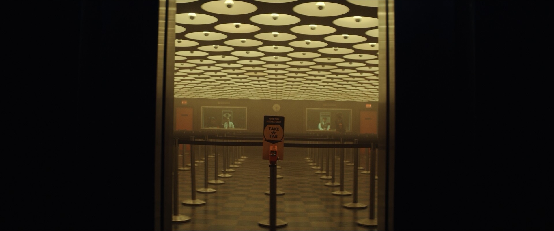
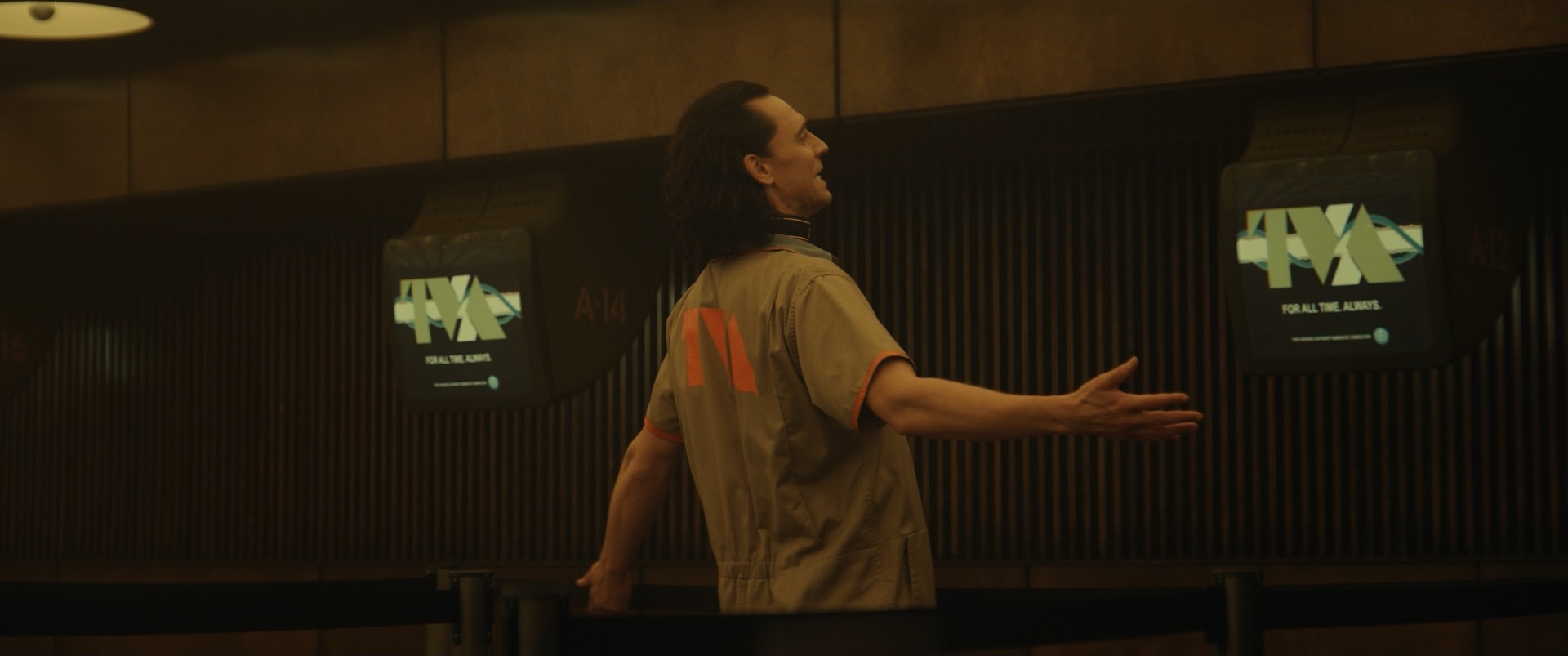
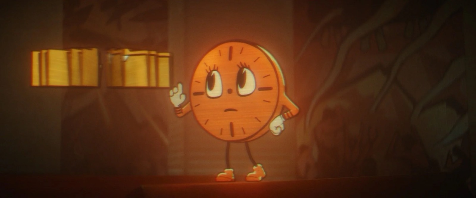
For the character of Miss Minutes herself we were referencing 40s and 50s animated figures with hyper simplified geometric form language, very few colors and no gradations. Illustrator Josh Viers nailed it after only a couple of passes. In addition, the propaganda video that Loki is made to watch in this set had a very specific look. Working with Illustrator Joe Studzinski, we made key frames for the animators to reference. We were heavily inspired by a 50s instructional cartoon made by the USAF called "Man and Safety" which had an unexpected whimsical quality despite the serious nature of the content. This was really exciting as we were trying to create this paradox of a seemingly sweet character espousing ominous propaganda and threatening messages.
The Time Theater
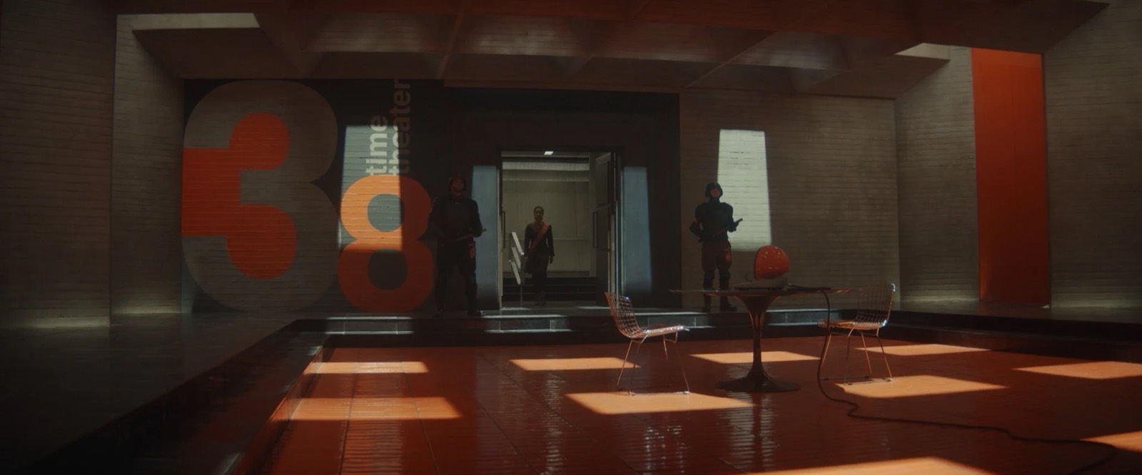
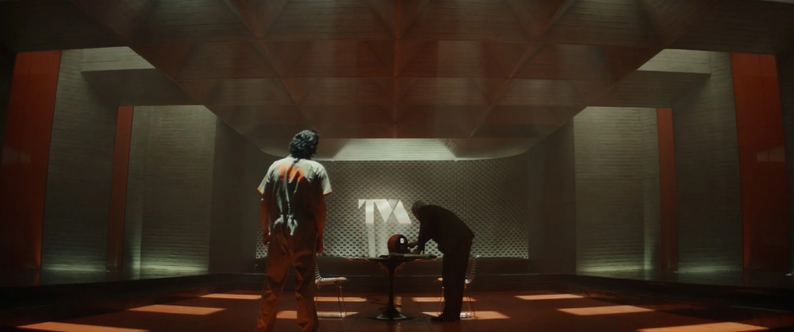
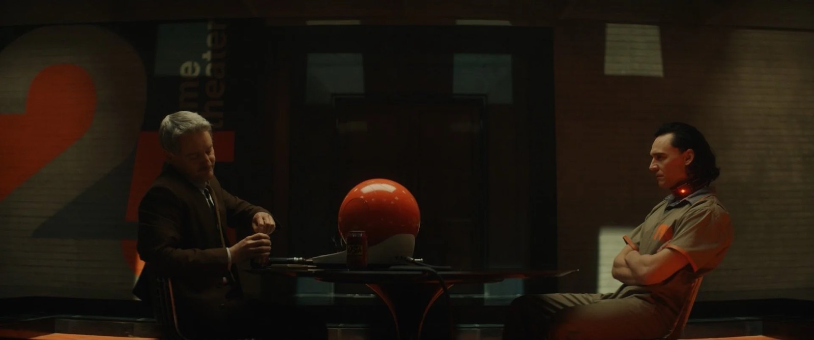
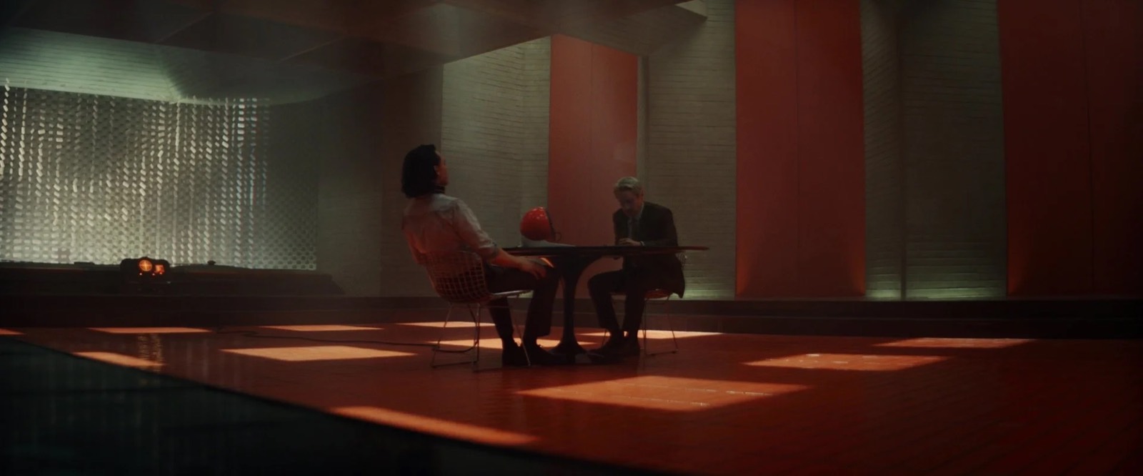
As I read it, the call for the Time Theater was to decimate the variant being interrogated by the scale and severity of the space. Loki refers to it as a “killing me, sort of room.” To build this feeling we went with a massive concrete superstructure inspired by the architecture of Pier Luigi Nervi and Paul Rudolph. And collided that again with mod architectural influences from the late 60s, including a huge and colorful super graphic indicating with unnecessary scale the room number. Art Director Domenic Silvestri worked with the talented plaster team led by Ernest Lopez to create a completely board-formed concrete superstructure. The only other materials were black granite and the vast field of “TVA orange” glazed tiles that our brilliant staff shop generated by the hundreds. Ostentatiously, there are the huge, mysterious, monolithic orange doors to break up the expanse of concrete. The austerity of the room called for some very bespoke objects to be the “jewel” of interest in the center.
My mandate was to avoid cyan light at all costs.
The only set dressing was a Saarinen table, two Bertoia chairs, and the bizarre TVA interrogation tech: the holoprojector and remote. Together with illustrator Shae Shatz, we created many iterations of these two pieces intended to be the hallmarks of the strange hi-tech analog equipment at the core of TVA operations. We presupposed digital technology simply never came to pass and that in the TVA analog tech just got more and more sophisticated and cross-pollinated with different alien and aberrant technologies plucked from assorted renegade timelines. My mandate was to avoid cyan light at all costs. That trope of science fiction seemed at odds with the tactile and lived-in world we were trying to build. At over 32’ in length with practically spinning spools of 35mm film and dozens of lenses, the holoprojector build was a collage of talent from construction, to fixtures, to Dan Sudick's extraordinary special effects team.
Time Court & the Expanse
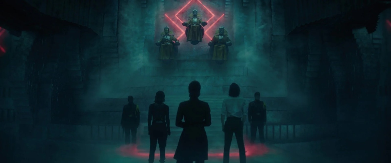
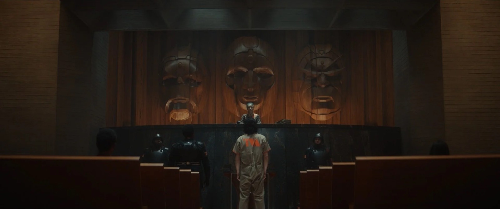
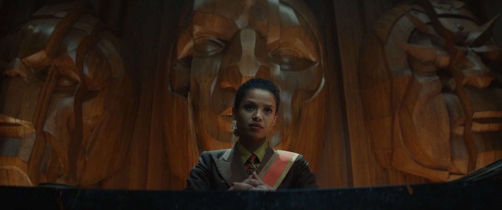
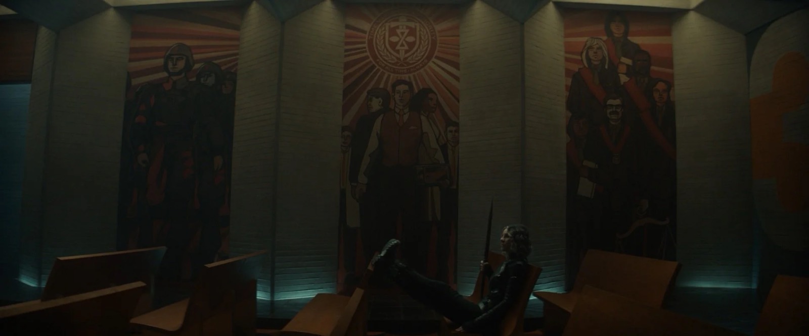
The Time Court was a changeover of the Time Theater. Expertly planned by legendary construction coordinator John Sampson and foreman Tony Median, we raised the ceiling from 13’ to 16’ and replaced the orange doors with six, towering 16’ tall mosaic murals. Comprising creepy propagandistic and cult imagery, mosaic was the perfect medium because of its absurdly labor-intensive nature. We wanted to show that it took a lot of people a really long time to create these mosaics. The only hiccup was that we actually had to make them fast. It was a tricky team effort that required much R&D, but in the end we landed on the process of dimensional printing. We would dimensionally print the individual, tiny, organic tiles but leave the grout areas low. This would save a huge amount of construction labor but the file design/prep to do this on six 16’ panels was a behemoth.
We wanted to show that it took a lot of people a really long time to create these mosaics. The only hiccup was that we actually had to make them fast.
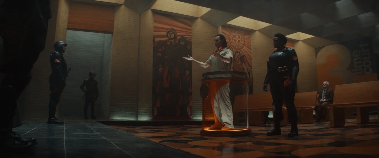
The initial six illustrations were made by Joe Studzinski; three of the six were glorifications of the TVA workers and the other three told the story of the grand multiversal war that led to the Time Keepers’ ascent. With such a large final print size the illustrations had to be made at a very high resolution. Once Joe’s work was done, graphic designer Jason Sweers began the process of adapting the illustrations to vector art and honing the precise forms and compositions. Then Jason with the help of our brilliant PA (now set designer) Samantha Klemm undertook the painstaking process of taking each fill color and converting it to a field of tiny organic squares with modulated color all in vector shapes. Once we had these files, and under the close watch of assistant art director Marlie Arnold, we were able to do a dimensional printing process directly on 16' tall goods and create the seamless appearance of towering mosaics. Complementing the mosaics were the similarly creepy and imposing, brutalist sculptures of the Time Keepers hovering above the dais.
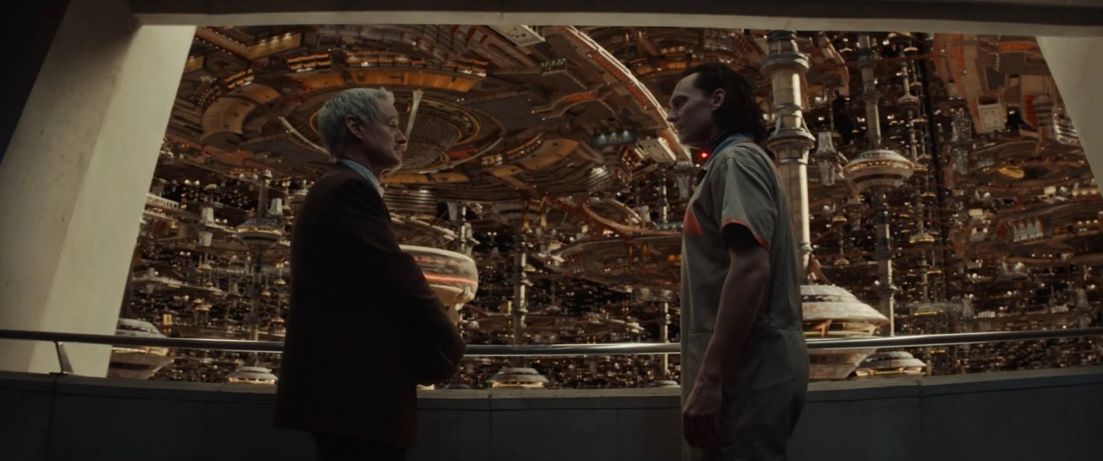
The expanse of the TVA was another very interesting visual challenge. This visual effects set extension that Loki and Mobius see from the viewpoint bridge was dubbed “the expanse.” We were tasked with trying to make one of the most awesome sights in the MCU. Others can be the judge of whether or not we succeeded, but the goal was to communicate an infinite scale of a bureaucracy so vast that it had taken on the mass of a nation state. The TVA exists outside of time and outside of a knowable physical world. There is no horizon or atmosphere, and there isn’t even an absolute up or down.
The spaces are at once interiors and exteriors. A massive hive of bureaucrats engaged in the Sisyphean task of cataloging the entirety of time, past, present, and future. I was inspired by Frank Lloyd Wright’s unbuilt city plans for Los Angeles, Niemeyer’s Brasilia, and the illustrations of Hugh Ferriss. It was Josh Viers’ incredible skill in Octane 3D that allowed us to generate illustrations with the scale and depth we needed to sell this idea. There’s typically no guarantee the final VFX will match the preproduction designs but in this case they did and I credit Josh’s exquisite images.
As a secret sauce, throughout the TVA is a smorgasbord of passive aggressive fascistic propaganda. These gorgeous posters created by graphic designer Jason Sweers warn and admonish employees of various things from limiting their lunch breaks to 17 minutes, to keeping their cubicles tidy.
Chronomonitoring
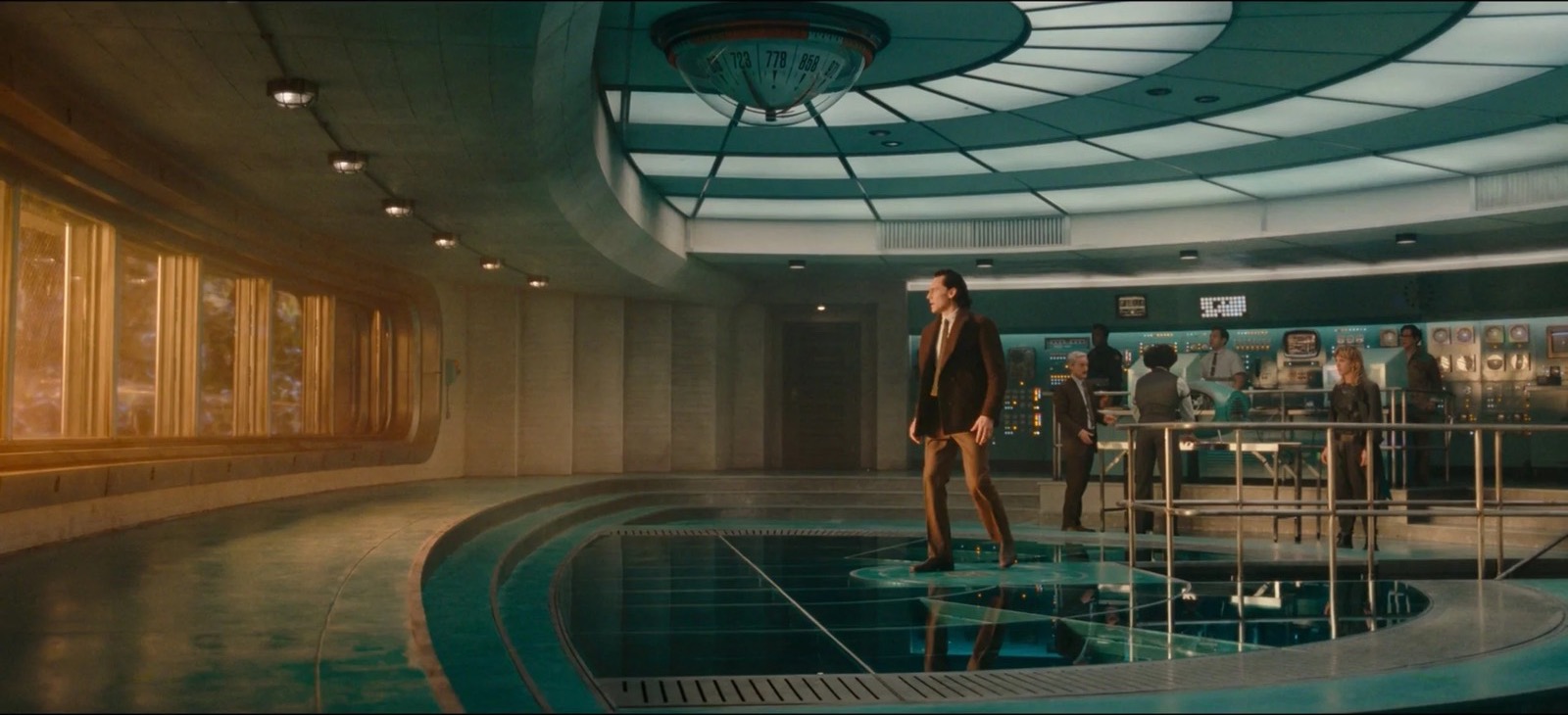
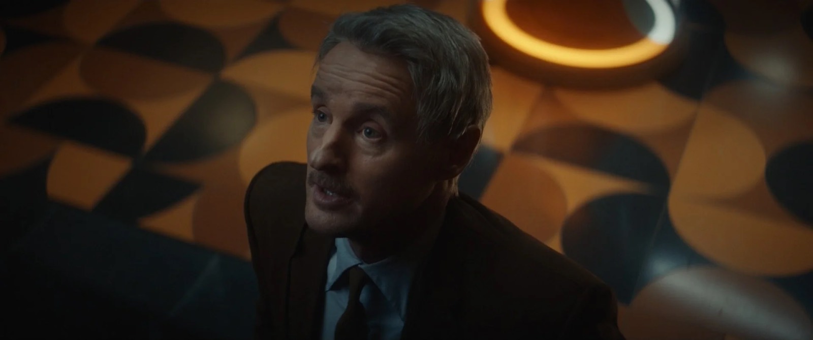
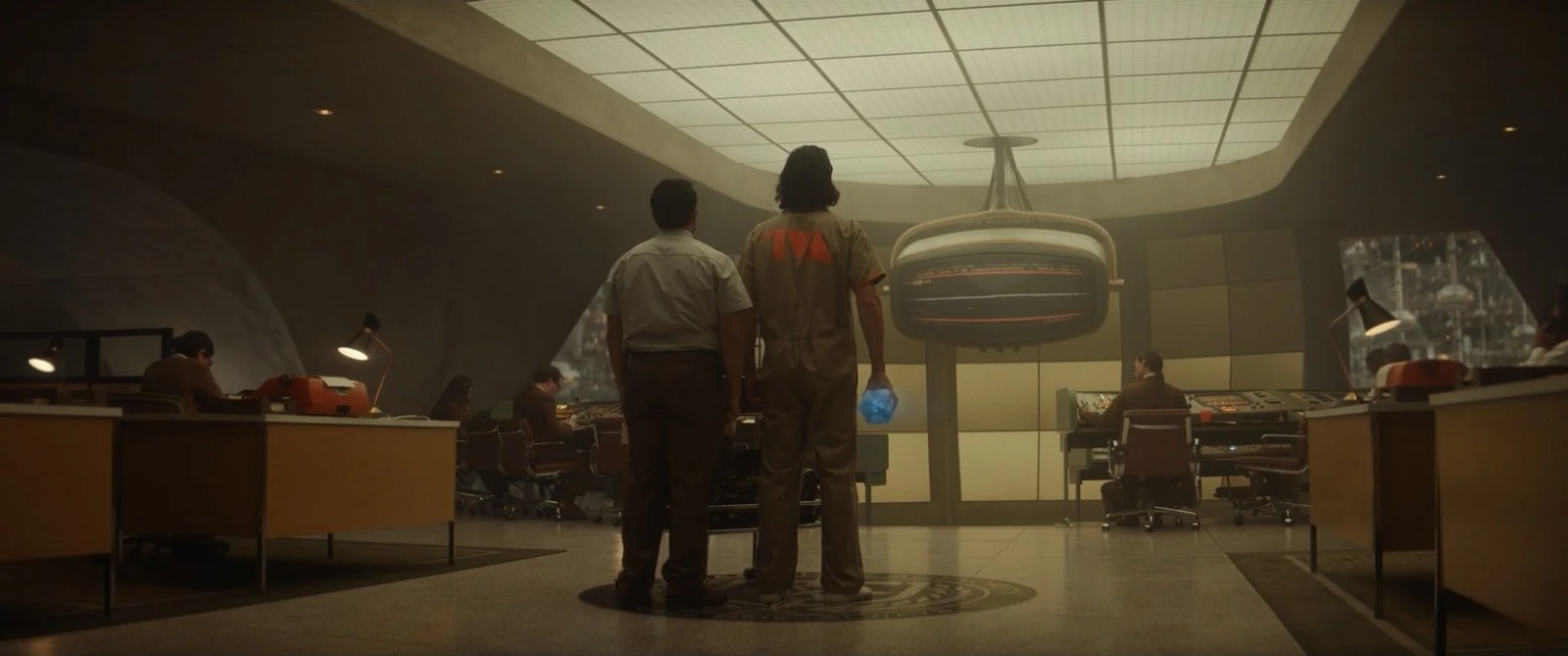
On first seeing Chronomonitoring Loki questions whether it is the most powerful force in the universe. This is the room where all of time is monitored. Loosely inspired by the late work of Frank Lloyd Wright, this panopticon was intended to communicate technical sophistication as well as imposing architectural scale. The focal point was of course the Chronomonitor itself. A seven-foot-wide analog screen that ceaselessly displays the sacred timeline for a small battalion of TVA techs vigilantly manning an array of mission-control-style stations. The other half of the space was a grid of cubicles for middle management analysts like Mobius.
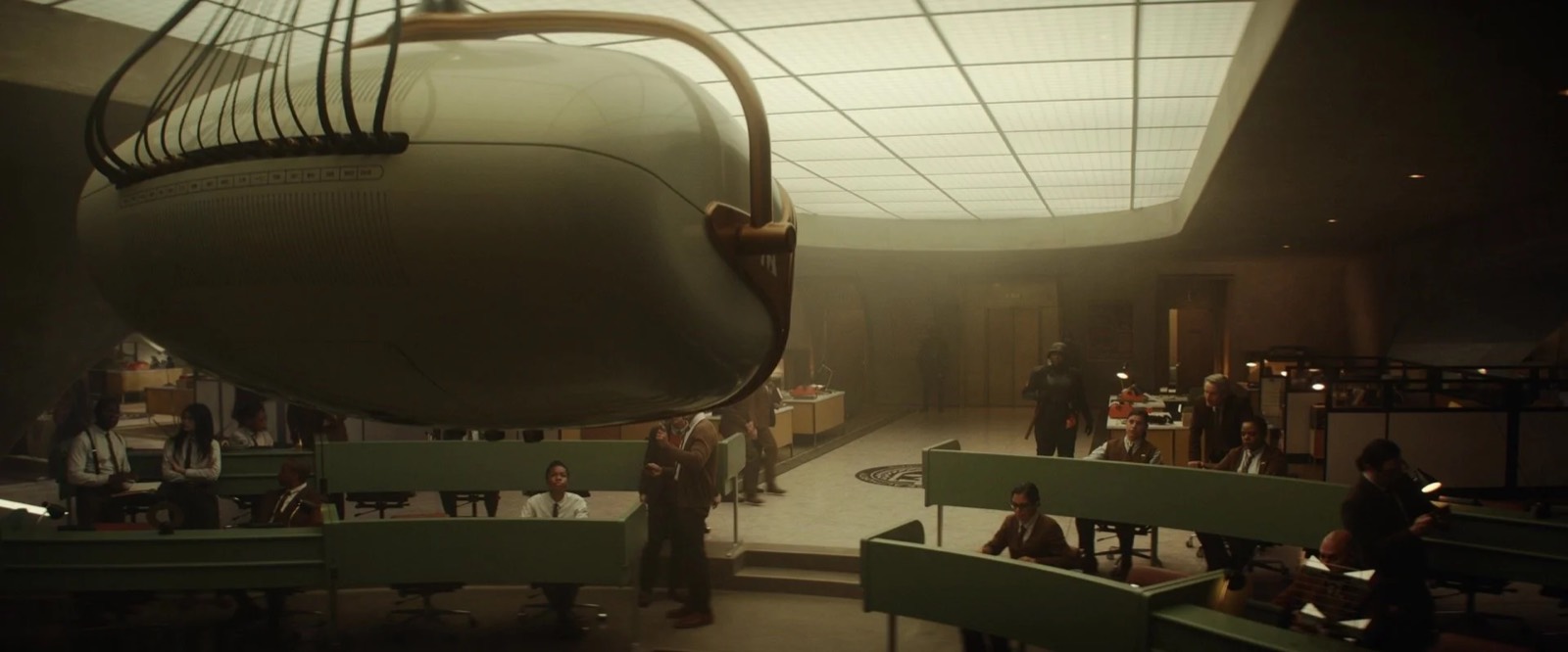
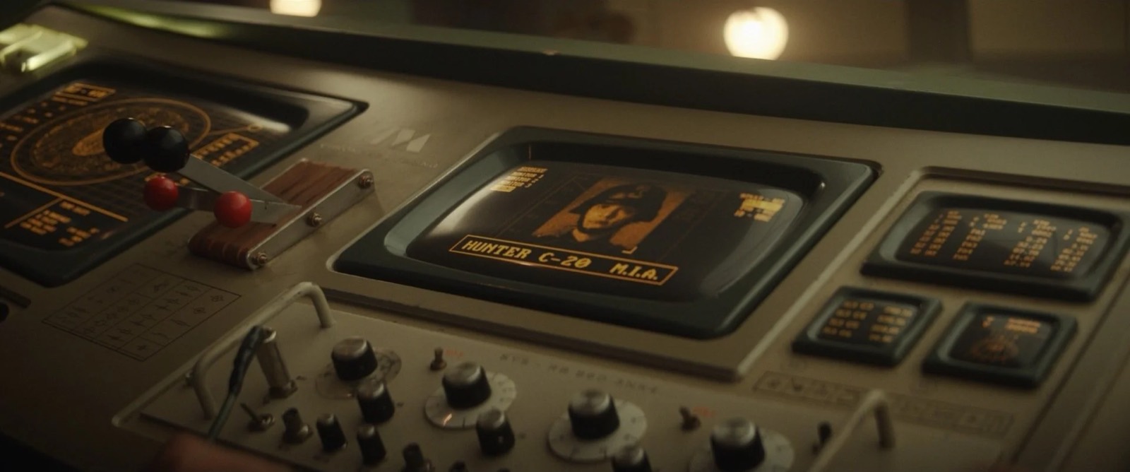
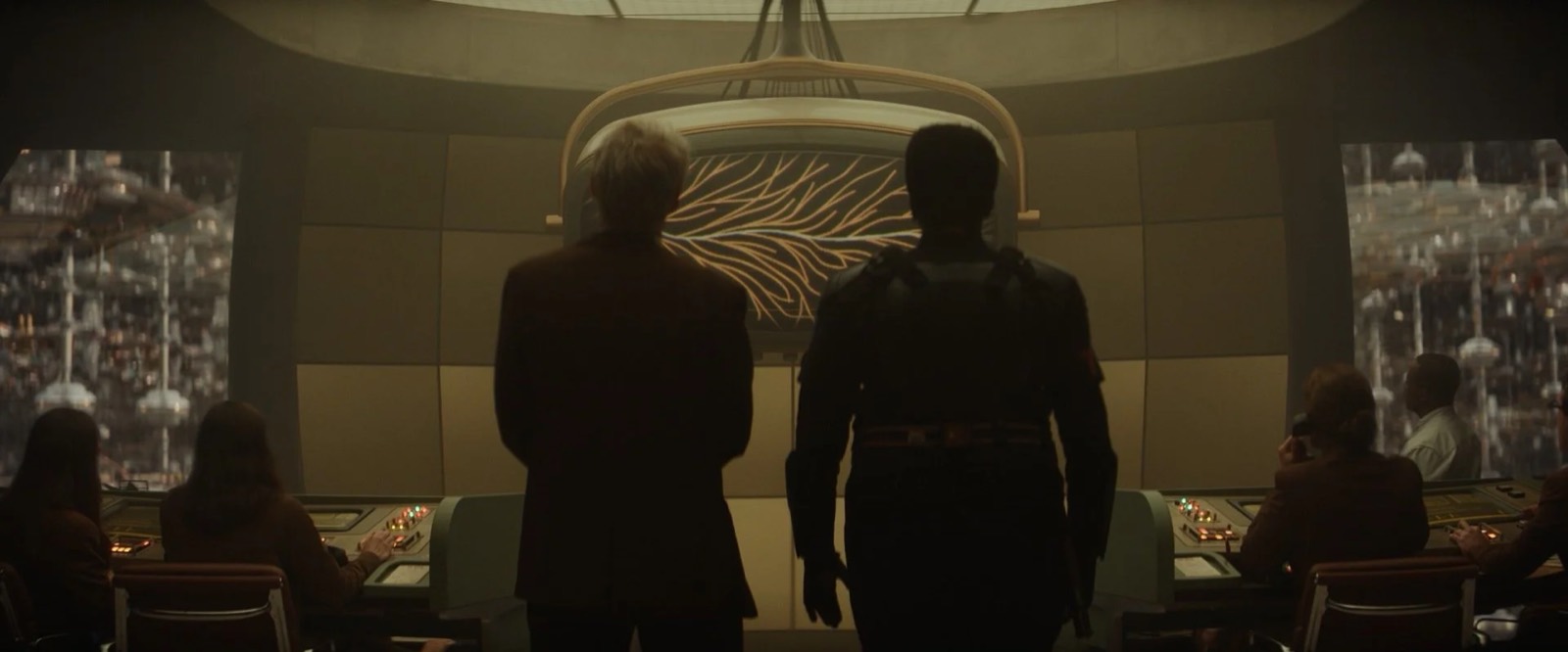
Left and right of the space were giant parabolic openings that led to a literally infinite number of these same spaces indicating the vastness of the TVA hive. Once again here we had a massive hung ceiling which acted as the primary light source for the set and lent itself to a nice variety of hyper graphic backgrounds for Autumn's beautiful low angle photography. Our wonderful set decorator Claudia Bonfe and her amazing team filled this space with the most beautifully curated collection of mid-century items and strange technical obscura. The stoicism of the architecture works only because of the vibrant miscellany that Claudia filled it with.
Renslayer’s Office
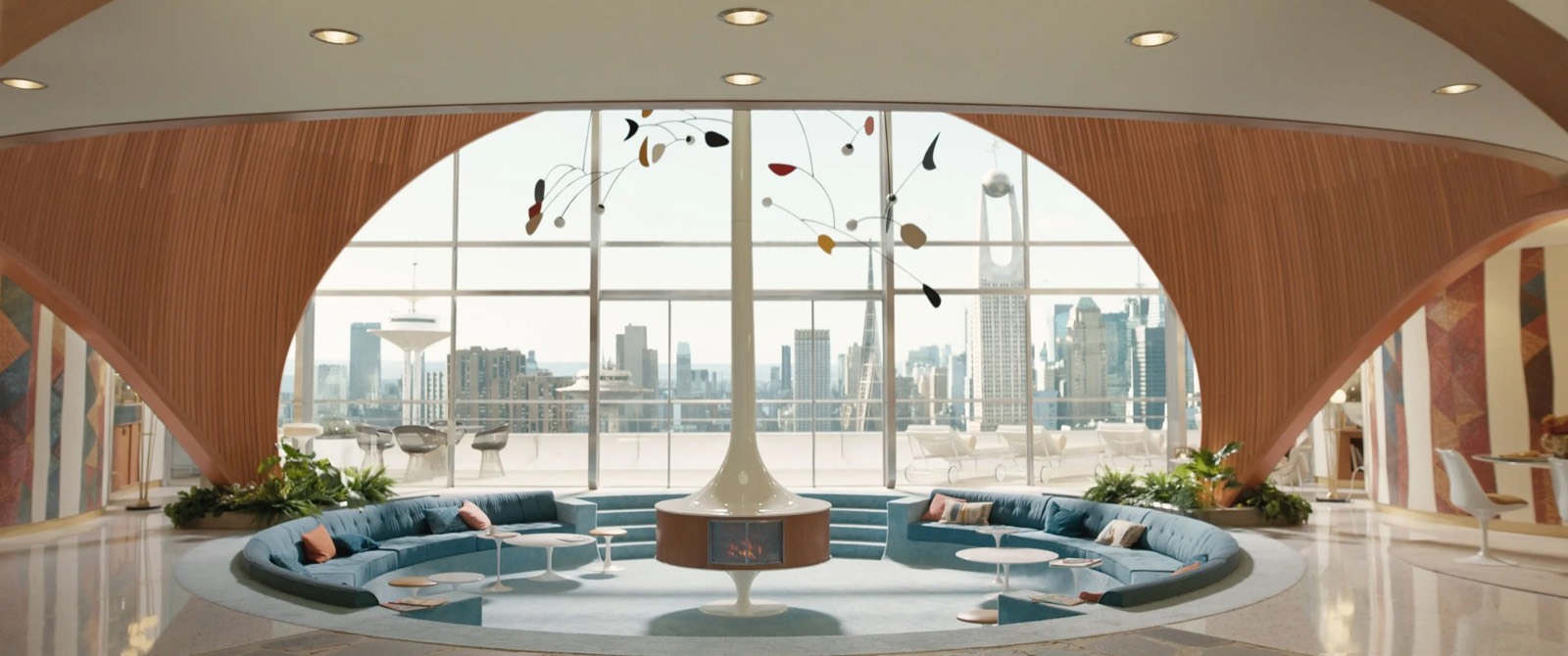
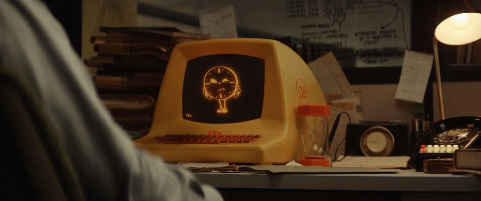
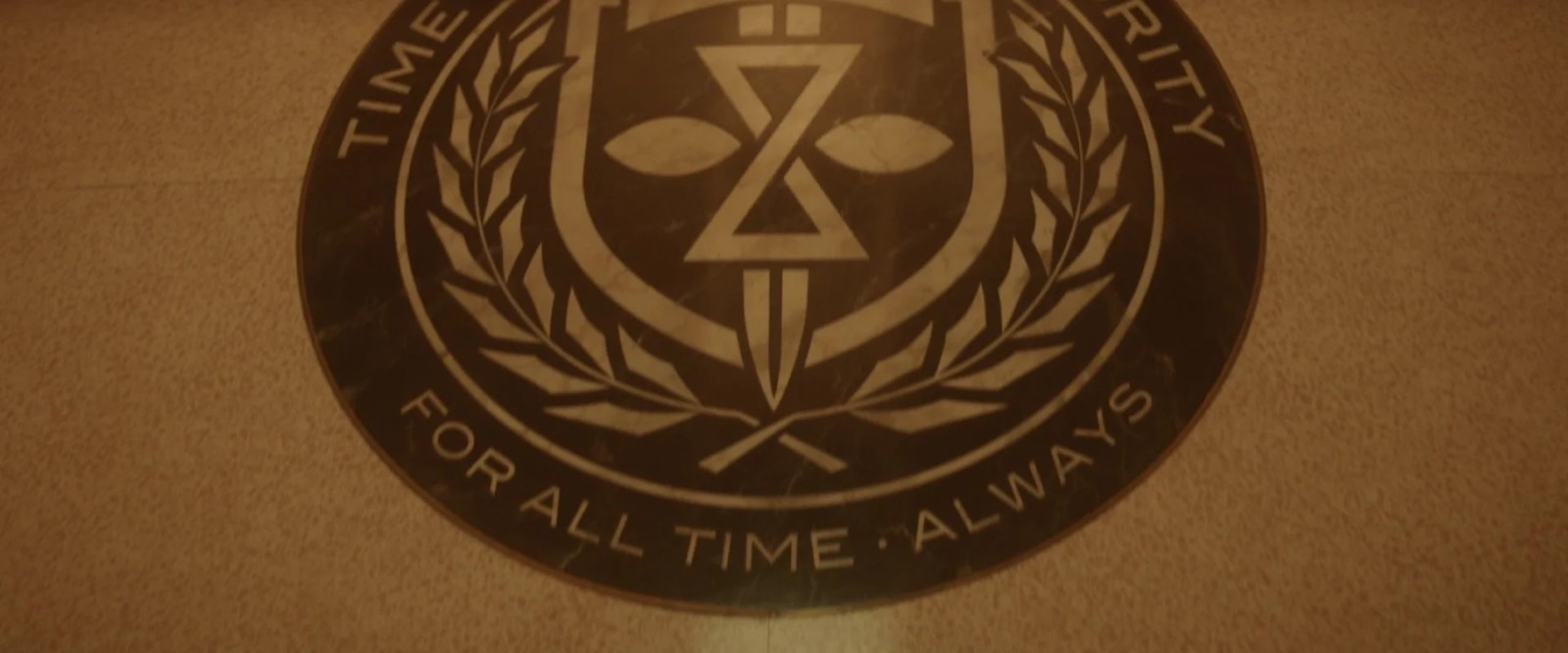
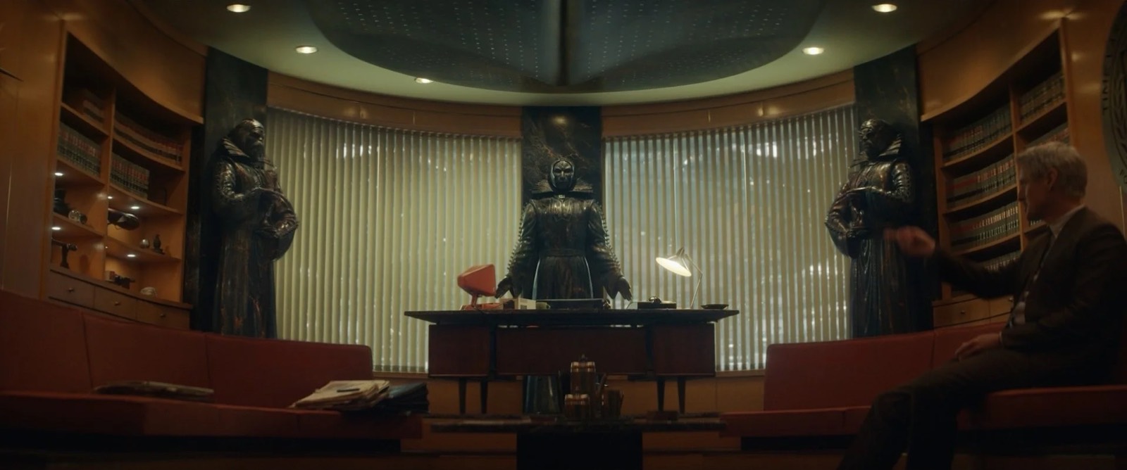
The office of Judge Ravonna Renslayer was meant to represent the pinnacle of TVA management. Her office has all the luxe, swank trappings of the late mid-century executive. Complete with conversation pit, shag carpeting, and built-in bar, reel-to-reel, and hi-fi. For her desk Claudia proposed a stunning mid-century CEO desk with a custom marble top made to give that extra zing. The desk dressing again included a specialty retro-futuristic computer custom built and painted in the TVA’s signature orange.
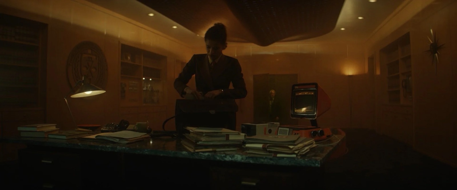
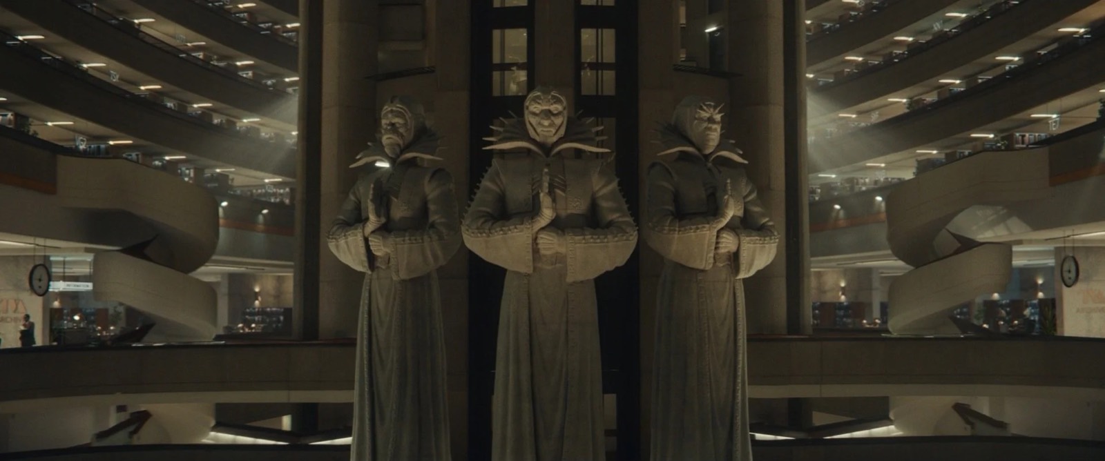
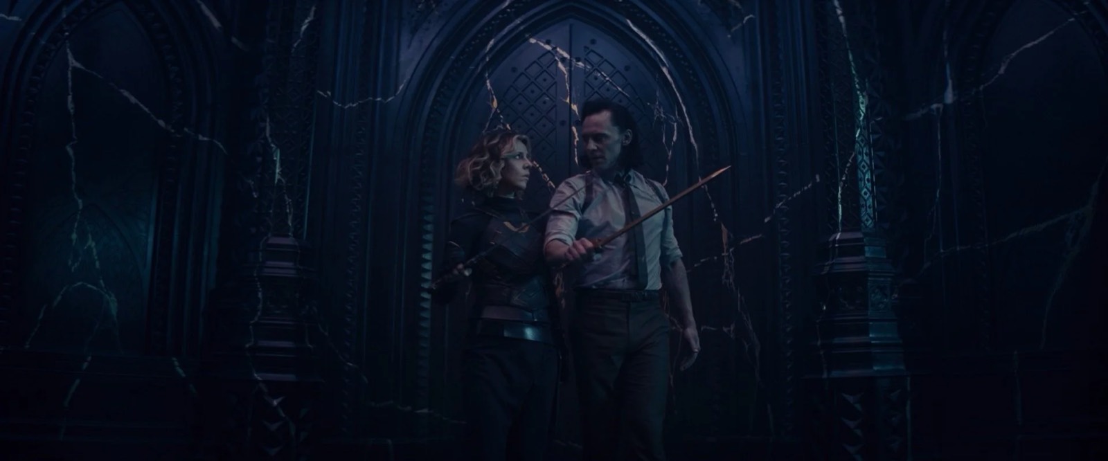
Contrasting the comforting mid-century whimsy, three ominous and strange Time Keeper sculptures preside over the office. These sculptures were masterfully made by lead sculptor Jamie Miller and his team. The designs were highly scrutinized as they had broad implementation throughout the show. Initially they were developed as maquettes before being sculpted at their towering 9’ height. The finish was another triumph of the crafts. Gifted painters Larry Clark and Greg Musselman concocted this finish that came to be referred to as "Citadel Stone." It was a black quartz-like asteroid material with a rich vein of gold. This finish made cameos on the sculptures as well as on the dais of the Time Court, and later we realize it is the same material that comprises the asteroid housing the Citadel at the end of time.
Lamentis / Shuroo
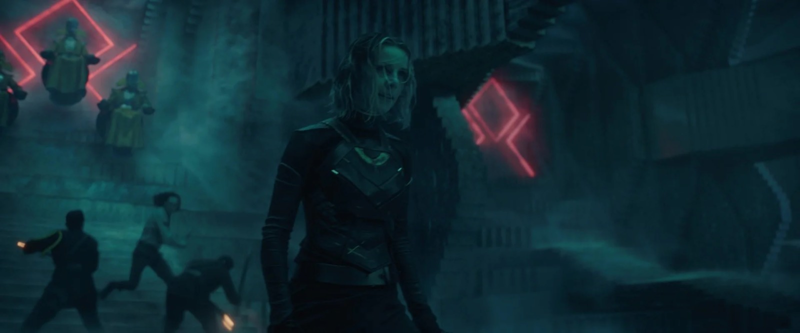
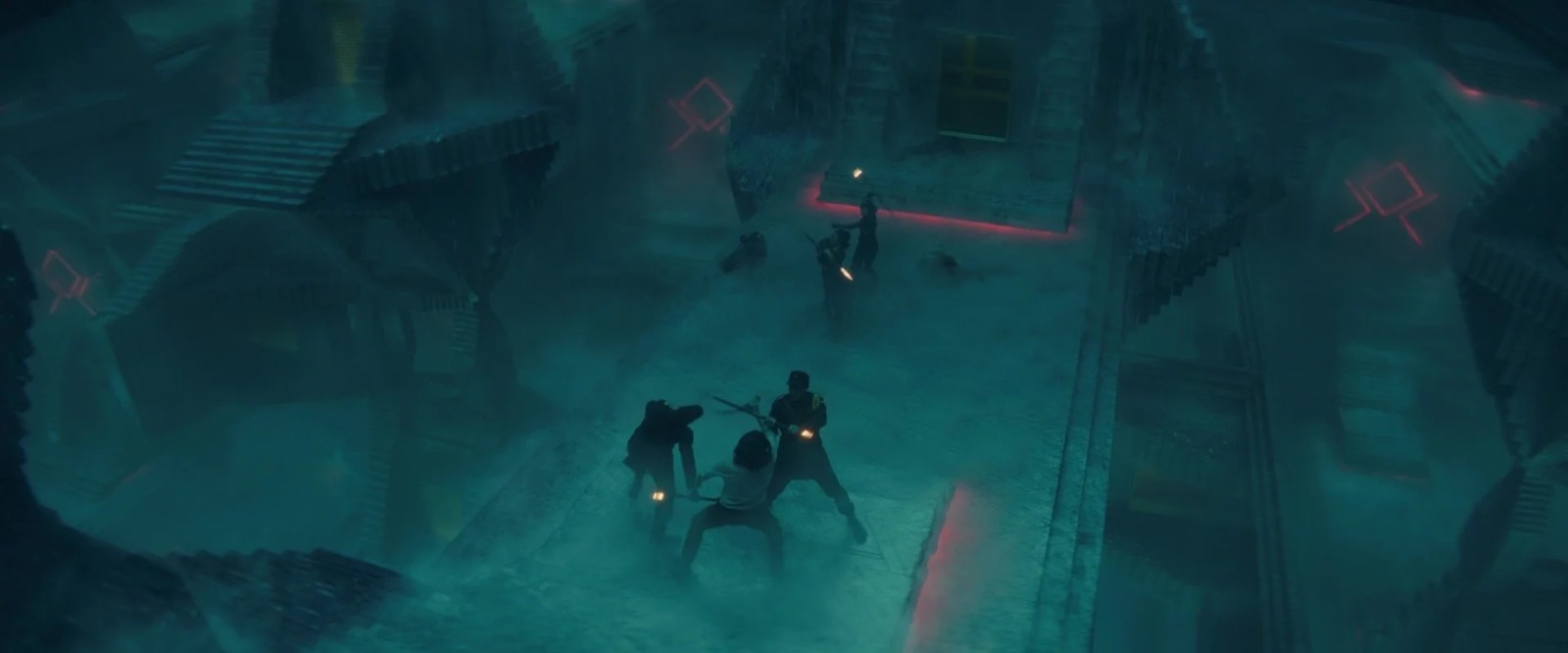
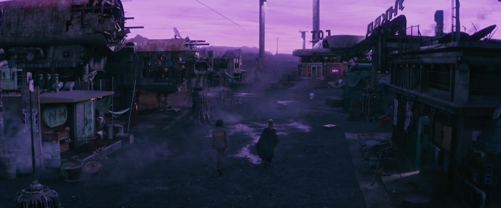
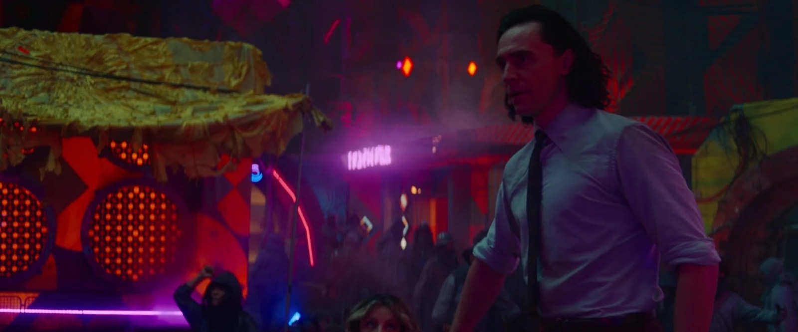
One of the most fun story locations outside of the TVA was the rough and tumble mining town Shuroo on the planet Lamentis 1. It was a bit of a head scratcher how to make a fresh-looking alien industrial town within the MCU which has already covered so much of this visual terrain to great effect. On top of that we needed a large 360° practical set as the goal was to shoot the entire scene as a oner akin to the famous scene in the refugee camp at the end of Children of Men. Also we were going to be moving quickly, and it was going to be night, so how to make something that isn’t just a blur of neons?
The paint selection process was brutal, as we could only evaluate colors in the dark with black lights.
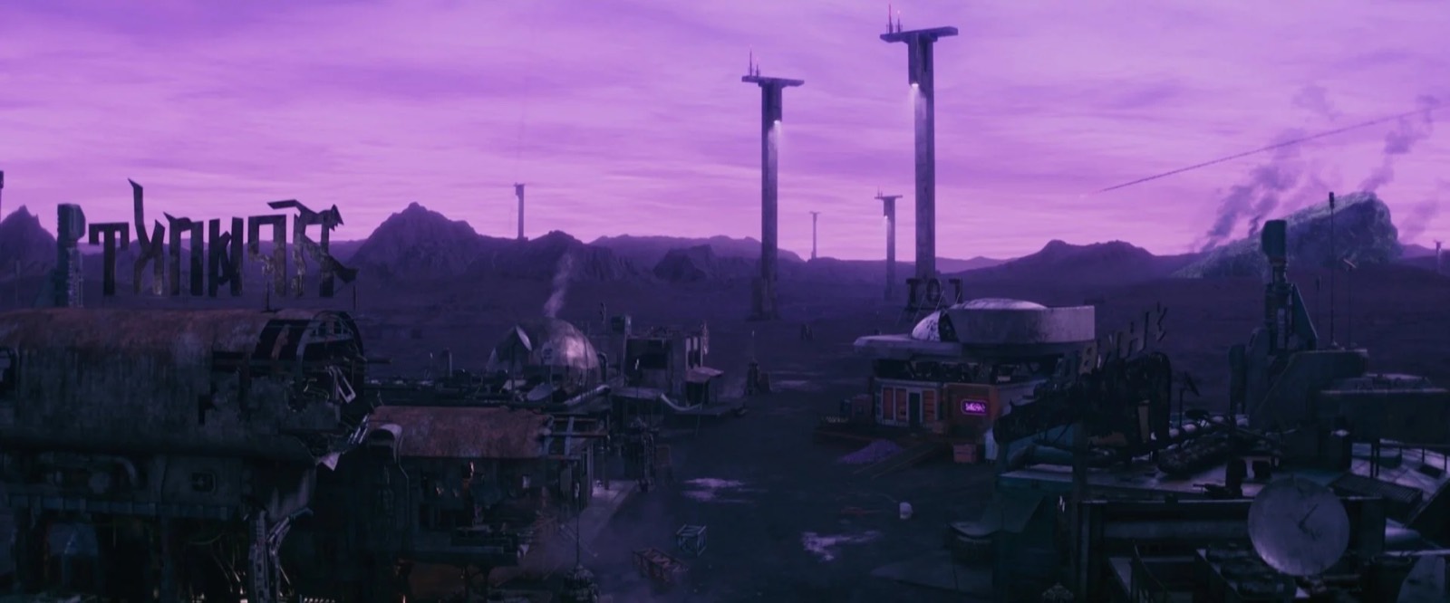
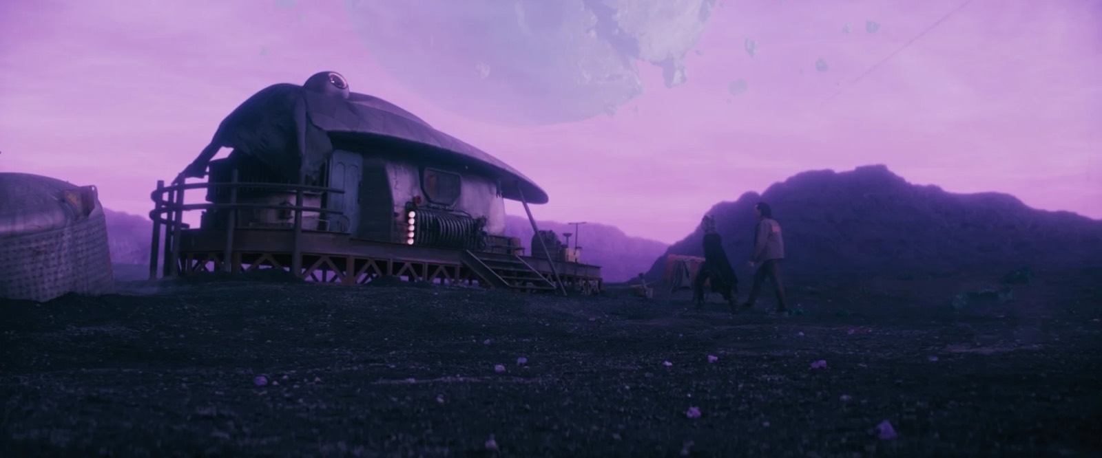
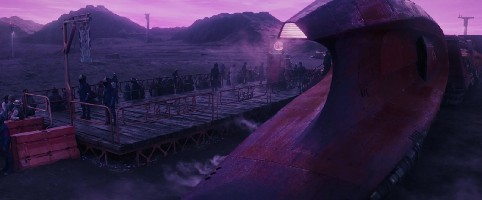
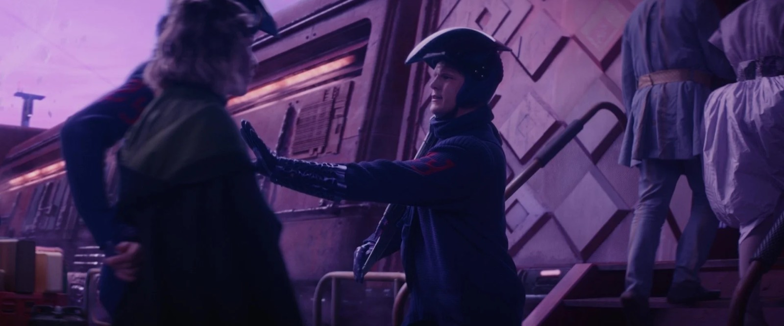
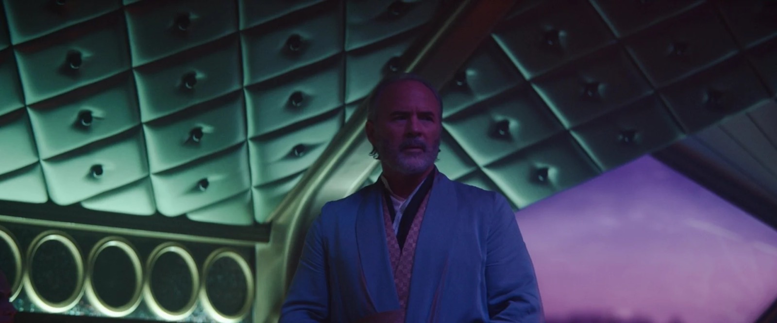
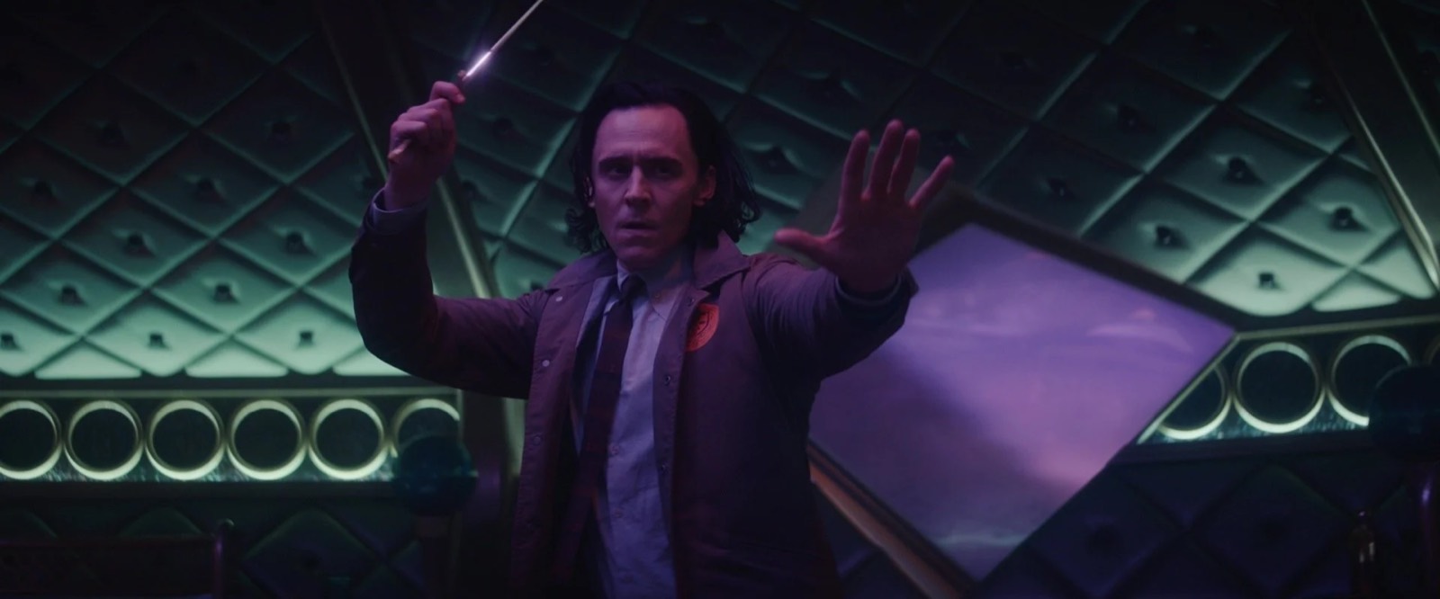
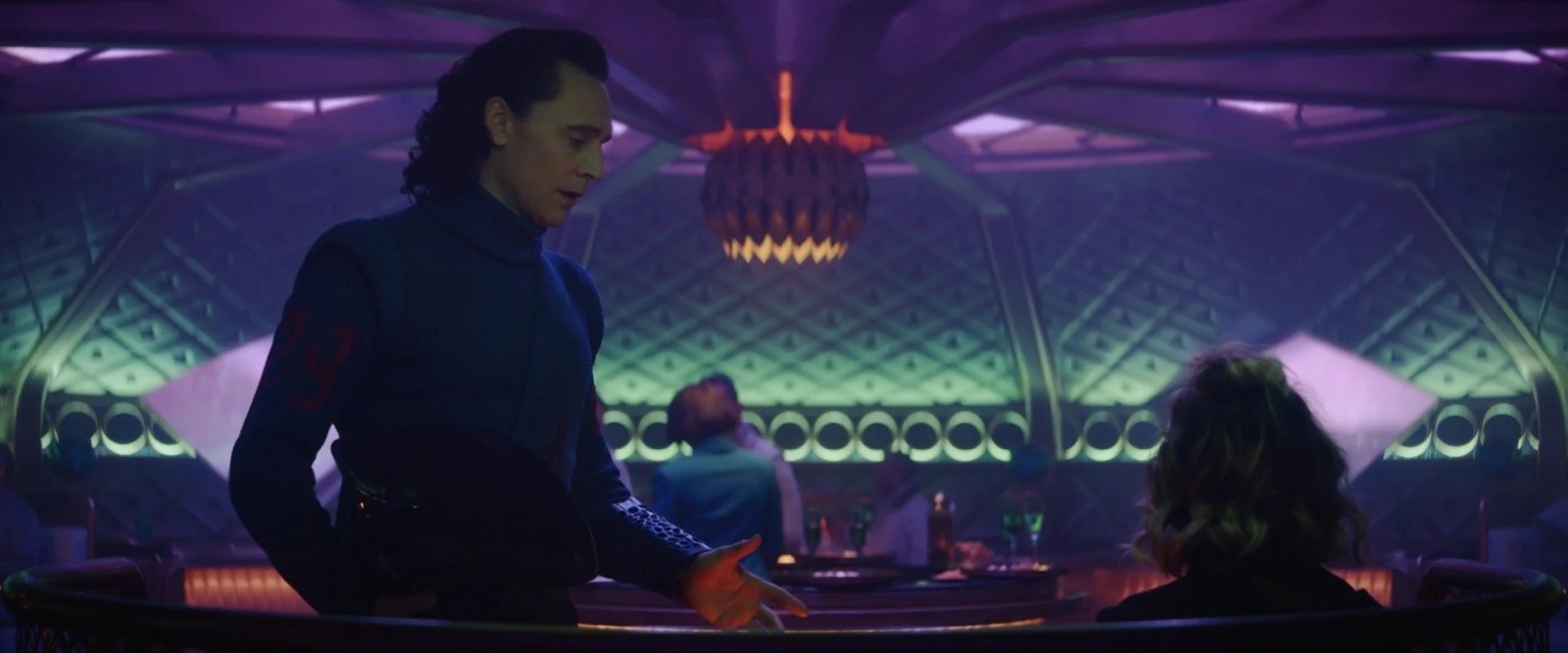
And after racking our brains for a while, art director Drew Monahan and I came up with the idea of using black light paint. Black light paint has come a long way from the fluorescent green and purple Zeppelin posters you remember from high school. Larry Clark's paint team provided us with a ton of blacklight colors to camera test. Once I’d sold the idea to Kate and Autumn, and set designers Nick Cross and Kevin Vickery had completed the master plan of our blocky and seemingly 3D printed-in-place architecture, we began a long process of working with illustrator Joe Studzinski and graphic designer Jason Sweers to create a dizzying array of graphic patterns.
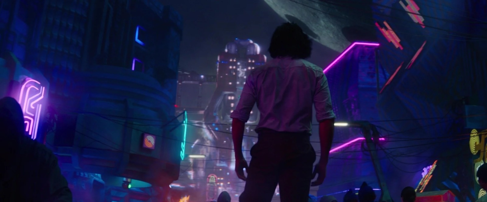
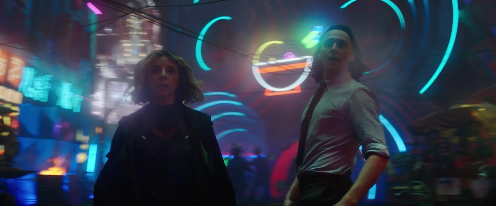
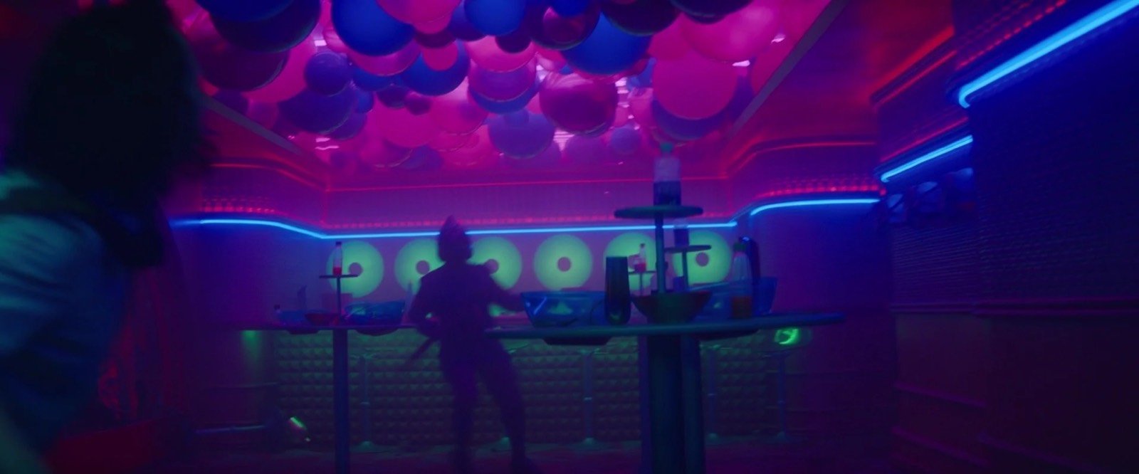
The patterns would contain black-light reactive and non-reactive colors to elicit a high-contrast, almost holographic cartoon effect. The paint selection process was brutal, as we could only evaluate colors in the dark with black lights. Further we had the challenge of lighting the buildings with black light without unduly polluting the actors and wardrobe. Working with the paint department, the fixtures department, and camera we ultimately arrived at an effective technique and a look that was novel within the MCU.
The Void
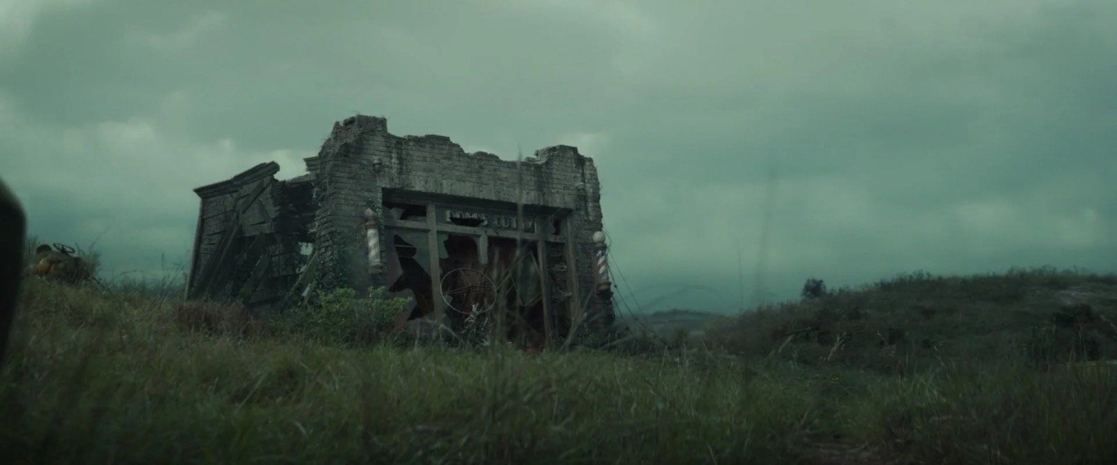
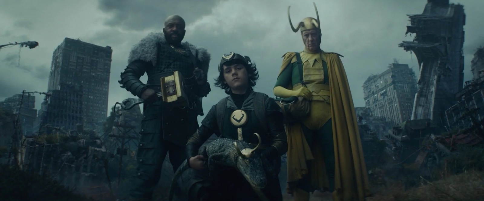
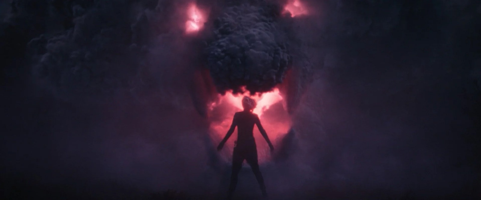
The paramount creative inspiration for the Void was to evoke a feeling of desolation and melancholy. Kate from the start was referencing the moors in England that she had seen as a kid. We explored the Void as a vast, empty landscape dotted with the desiccated husks of realities deleted from time. The characters camp out in what seems to be the ruins of a very charming pre-war brick barber shop, but if you look closely at the signage you'll see that the patrons and the proprietors are not quite human.
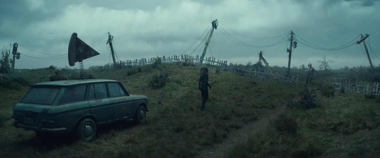
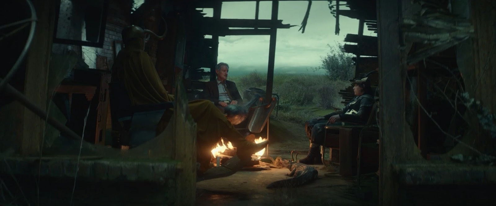
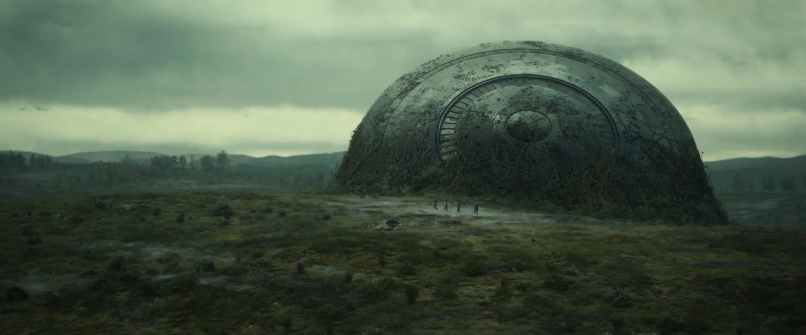
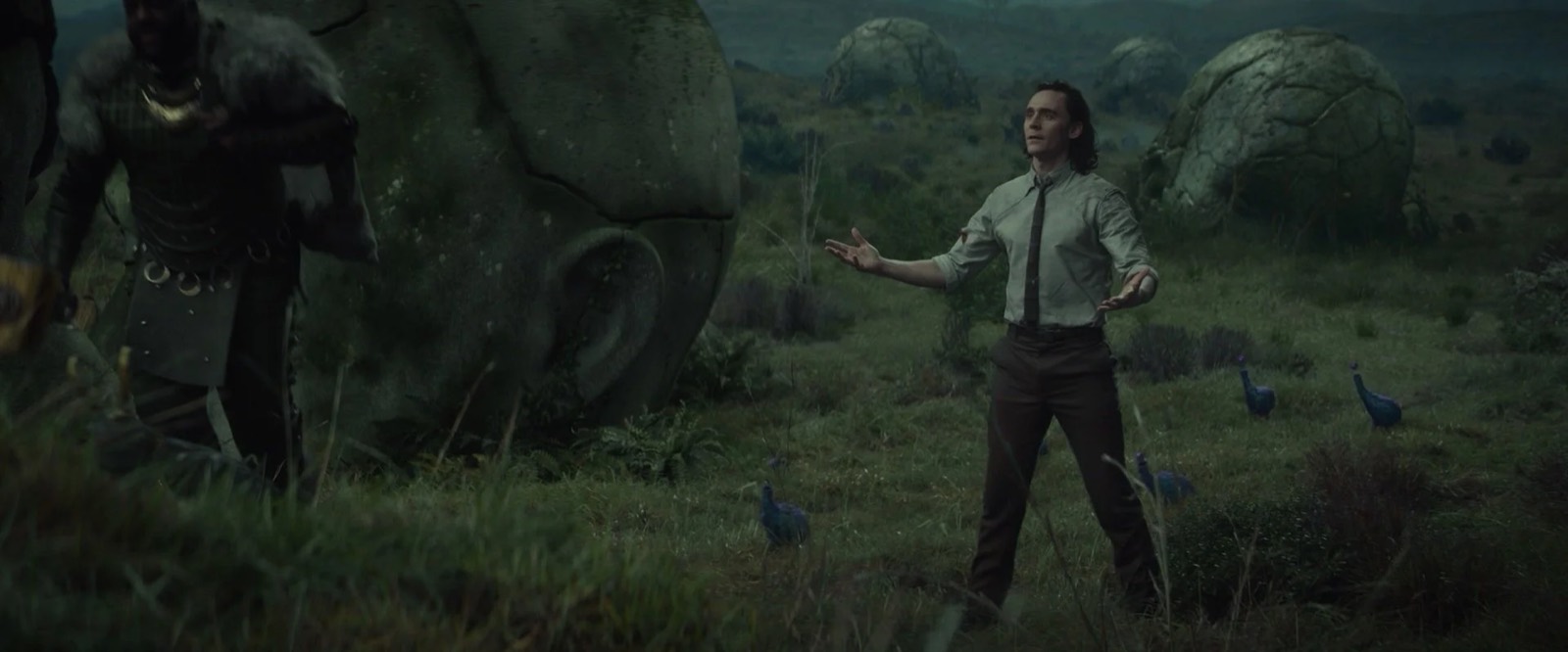
The Void is the garbage disposal of time where aberrations that should never have existed are banished and then devoured by Alioth, an insatiable temporal storm that consumes everything it sees. In order to add a little vibrance and life to the Void I proposed to Kate that we add some strange little creatures that have improbably rooted in the Void. I sketched what ended up looking like a feathered stomach with tiny legs and no head, just a gullet which had a shiny ball levitating above it as it breathed in and out like those old toys we all had.
The Loki Palace
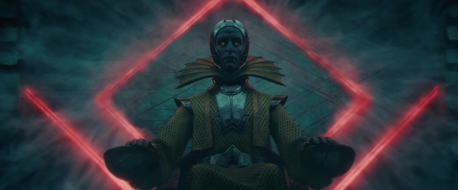
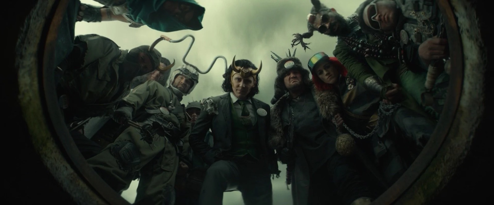
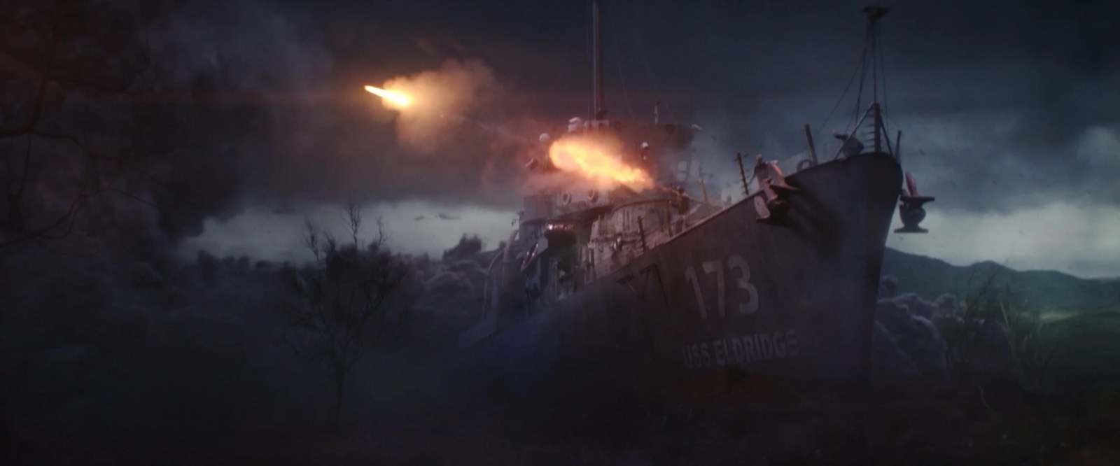
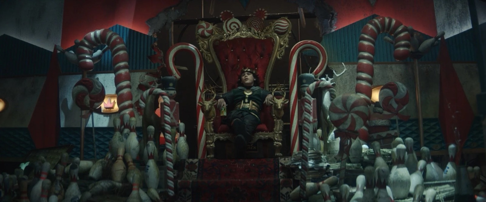
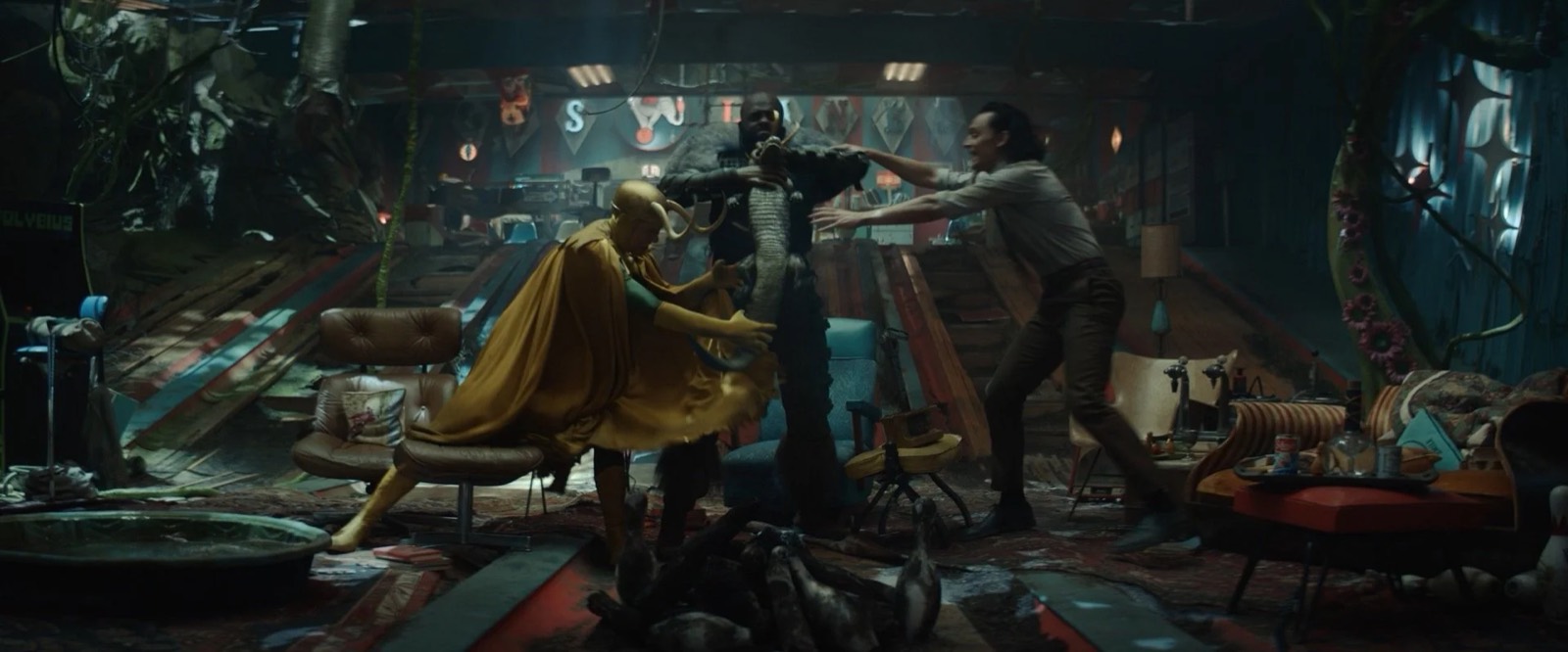
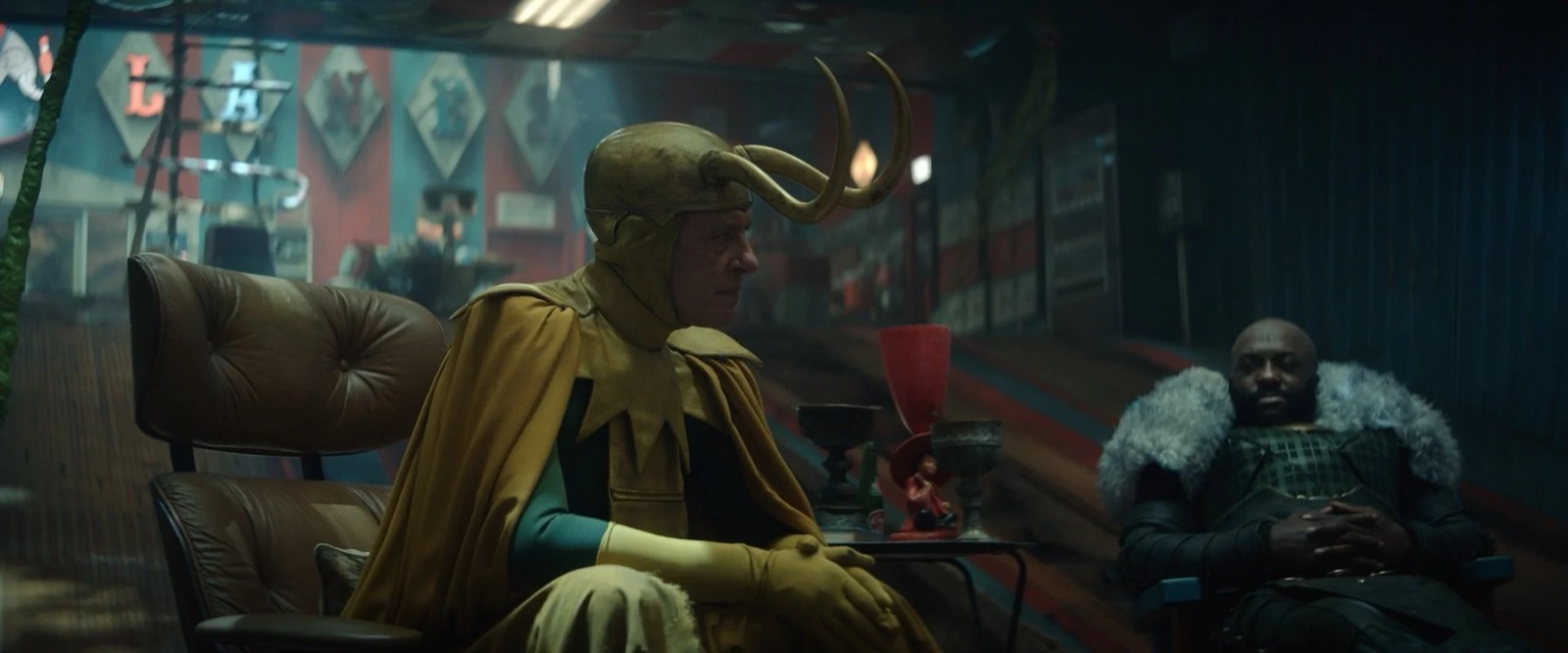
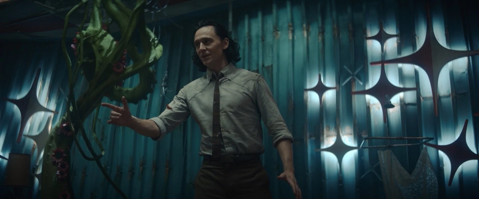
The Loki Palace might be my favorite set. This was one of those fun opportunities where the script offered a lot of latitude to propose something. The set was described simply as a subterranean temple, but open-ended as to whether it was a literal temple or rather a place where the Loki variants gathered to bask in their collective Loki-ness. Being that the Void is a trash heap, it stood to reason that below the ground there would be strata made of the husks of devoured realities. We arrived at the concept of an old bowling alley that was deleted long ago and had since been buried by accumulated debris of other realities. Deep below ground with only a few light wells connecting them to the surface, the Lokis were safe from Alioth and had fashioned for themselves a sort of man cave/throne room.
There was not a level surface or a single plumb wall in the set.
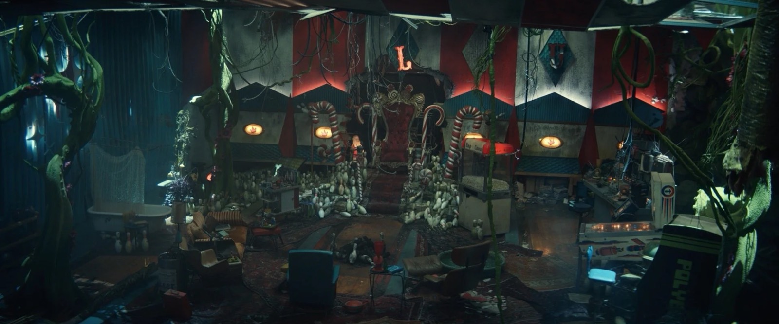
Set decorator Claudia Bonfe filled this split-level set with beautiful random eccentricities, including at the suggestion of producer Kevin Wright, the infamous Polybius video game machine. As a finishing touch I had the idea that the improvised throne that Loki sat on would have been scavenged from a mall Santa in a deleted shopping mall at Christmas time. Art Director Lauren Abiouness and assistant art director May Mitchell did an extraordinary job managing the dozens of strange custom elements that needed to be built, modified or found for this strange composite environment. There was not a level surface or a single plumb wall in the set. Lauren worked closely with the sculptors and greensman Dan Gillooly’s talented team to build some particularly odd alien plants I had sketched in.
The Citadel
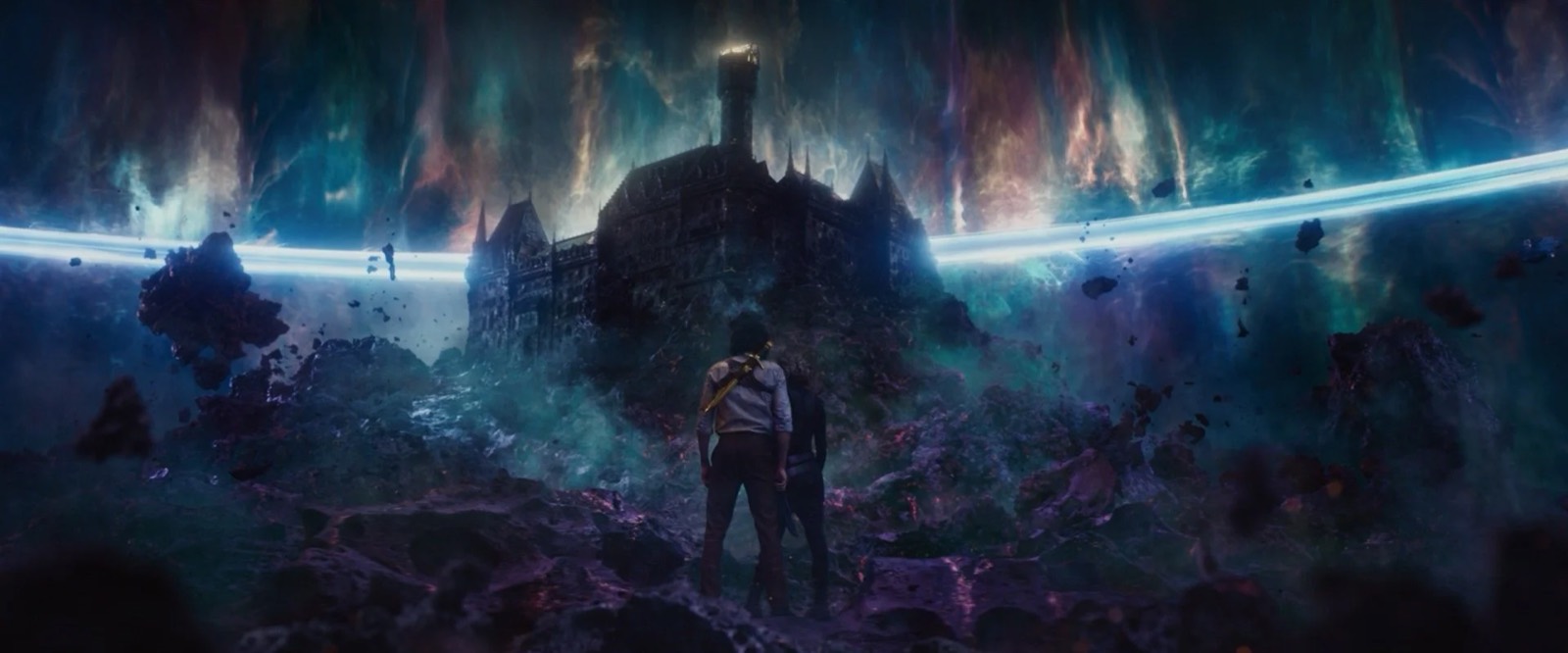
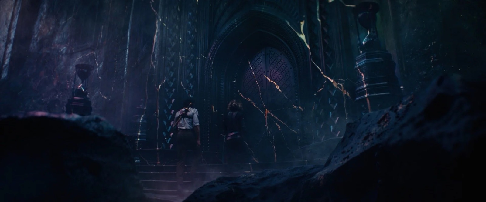
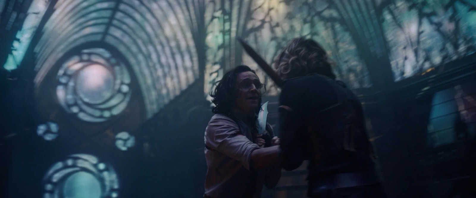
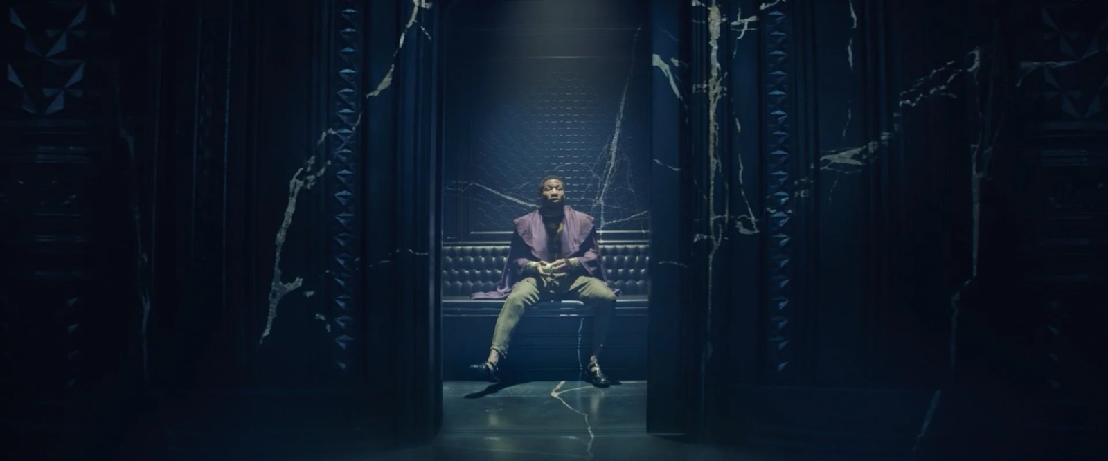
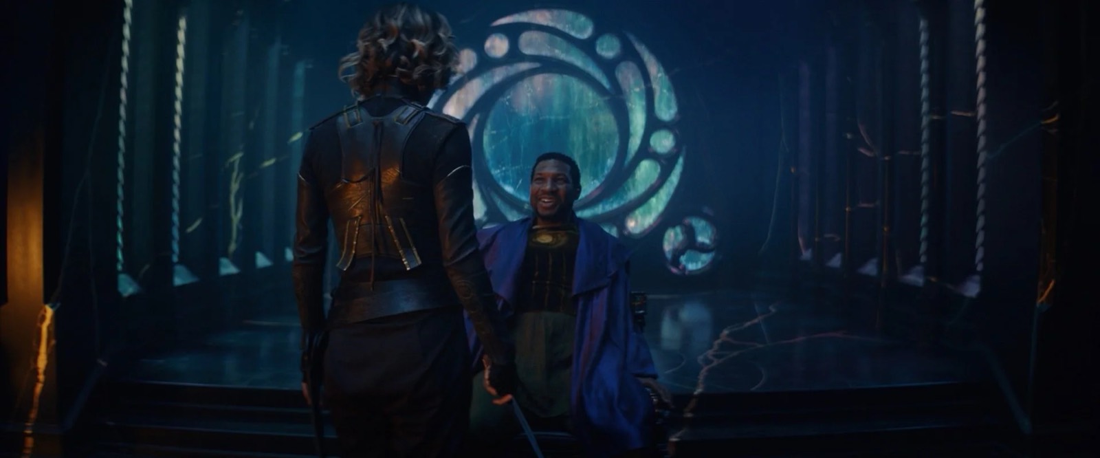
Our journey concluded at the Citadel at the end of time. Based on the comic source material this is a fortress perched on top of the asteroid floating outside of time. We took this basic idea and ran with it and came up with the notion that the Citadel was literally hewn in situ from the asteroid itself like Petra in Jordan.
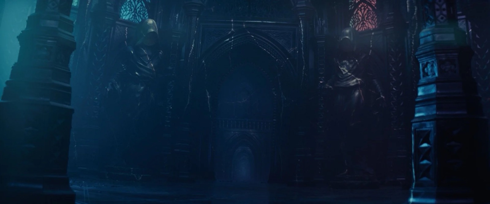
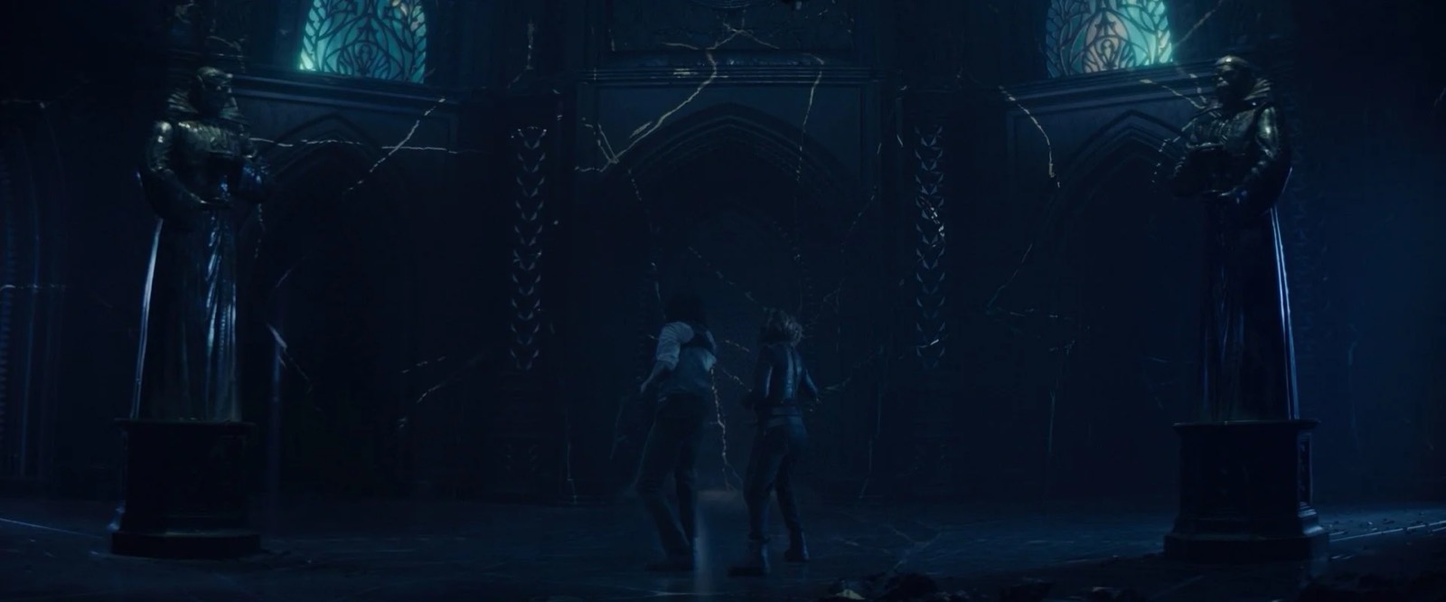
We felt strongly that everything should be made from the asteroid stone and nothing else.
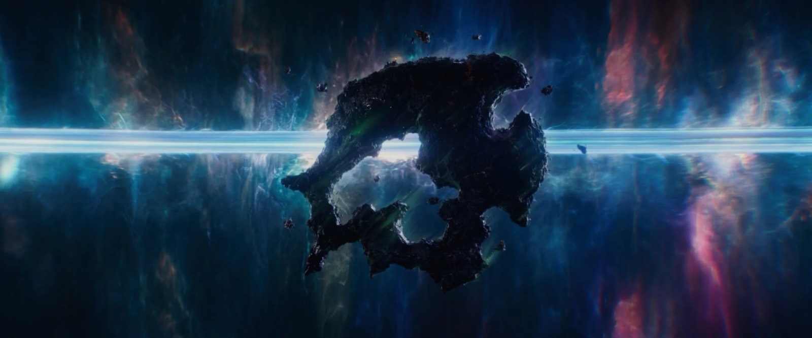
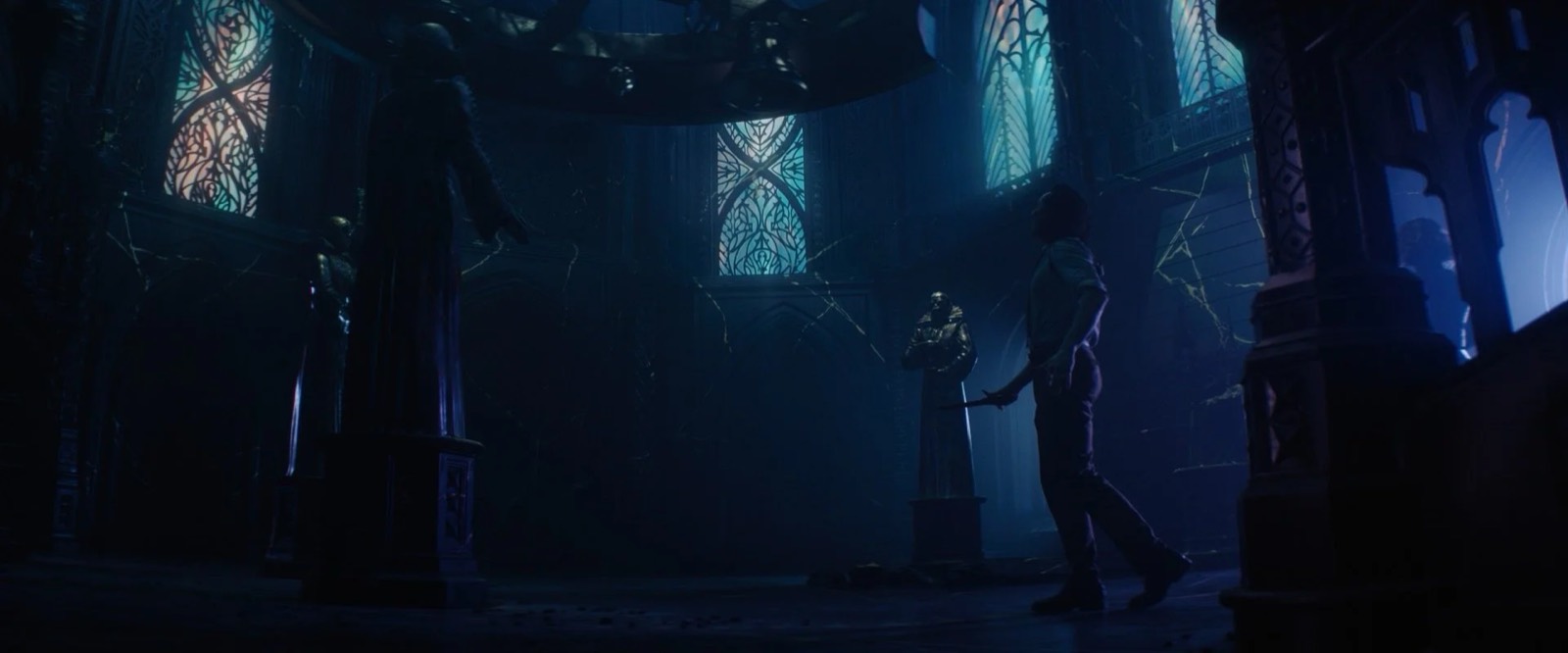
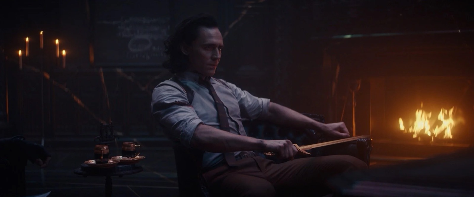
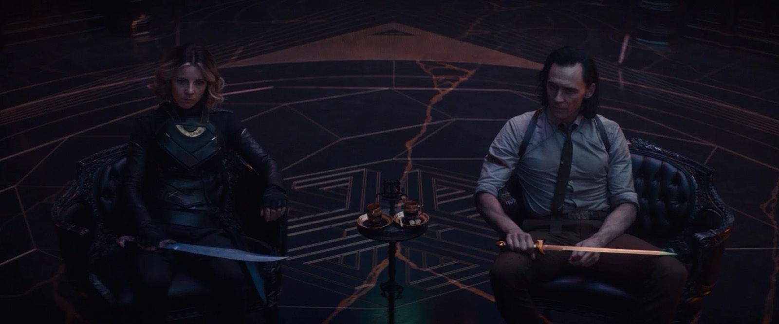
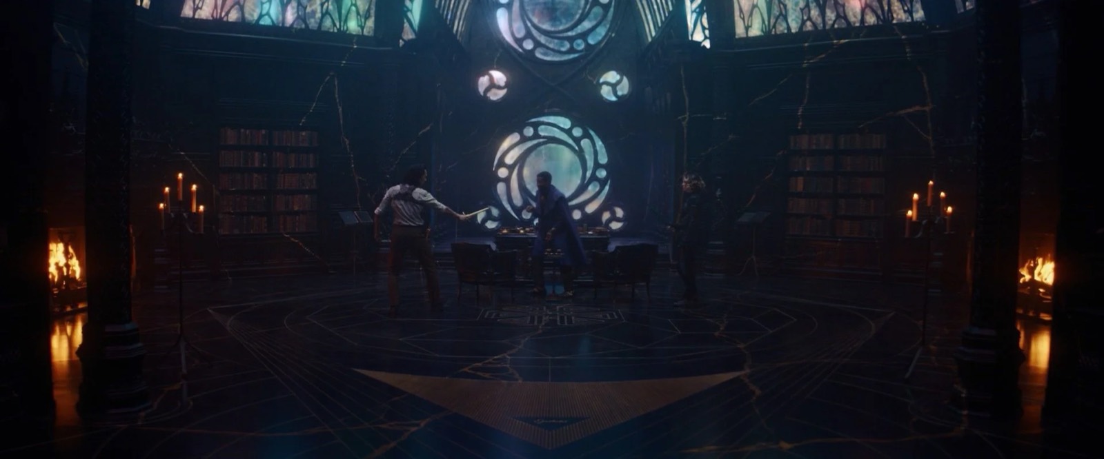
We wanted to evoke a Hearst Castle– or Xanadu-like atmosphere of a mysterious, eccentric figure rattling around an abandoned behemoth monument of vanity. The architecture itself was loosely inspired by the English Renaissance and the floors were engraved with massive interconnected astrolabes and astrological charts. Two giant 13’ hooded figures greet entrants as they come in. These massive sculptures were sketched up by Illustrator Vance Kovacs and beautifully sculpted by Jamie Miller's team. There were no practical lights in the Citadel, as we felt strongly that everything should be made from the asteroid stone and nothing else. So the entire Citadel was lit by huge fireplaces, candles, and from the light of a massive nebula above them. Huge windows and, in the case of the office, a conservatory ceiling allowed this rainbow light to pour into the black and gold interior.
Conclusion
The sheer variety of imagery that we were privileged enough to create on Loki made it feel like we had worked on six different movies and not just episodes of a series. Certainly for myself I can honestly say this is the most fun job I've ever had. I know it will be some time before I land on a project with such a rich source material, such brilliant collaborators, and such an amazing art department. I'm grateful for all of them. It was pure joy to make mischief in this sandbox.
Images © Marvel Studios. All rights reserved.